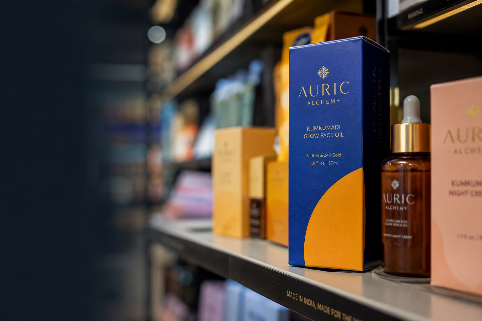
.png)


The best packaging style for a D2C brand is the one that makes your product instantly recognizable in your specific environment; shelf, scroll, or thumbnail; while making the price feel worth it. There is no one packaging style that works for everyone.
Minimalism works for some categories. Bold and expressive packaging works better for others. The mistake most Indian D2C founders make is choosing a style they personally like instead of choosing the style their customer's trust.
This guide covers the 7 packaging styles that work best for Indian D2C brands, which categories they suit, and which brands have executed them well.
What Is a Packaging Style?
A packaging style is the overall look and feel a brand uses across all its products. It includes the color approach (one main color vs. multiple colors), illustration choices (none, simple, or detailed), text styling (bold and expressive vs. clean and simple), packaging shape choices, and finishes like matte, gloss, soft-touch, or kraft.
Packaging style is not just a logo or a color palette. It is the big-picture design decision about how all these elements work together across every product. A brand can have a beautiful logo and still end up with inconsistent packaging if every product line looks like it was designed by a different person.
Why Your Packaging Style Decision Matters More Than You Think
Your packaging style communicates three things before a customer reads a single word:
- whether the brand feels trustworthy
- which category your product belongs to
- what price range it fits into
- whether the brand feels trustworthy
Choosing the wrong packaging style is one of the biggest reasons good D2C products fail on the shelf. A premium product inside an overcrowded and busy package feels cheap. A mass-market product inside extremely minimal and clinical packaging feels intimidating and expensive. Both lose sales.
The right style is the one that matches the common style of the category closely enough to feel familiar but differs enough to stand out.
The 7 Best Packaging Styles for Indian D2C Brands
1. Clean Minimalism
What it is:
A clean minimalist style uses white or off-white packaging with a subtle color accent, one clean typeface, and no illustrations. The product name and key benefit become the main focus on the front side of the pack.
Who it works for:
Skincare brands targeting premium urban buyers. Supplement brands with a science-based brand image. Brands where the ingredient story itself is the product story.
Indian brand example:
Minimalist executes this style very well. Their packaging uses a white base, one sans-serif font, and a color-coded label for each product line (blue for niacinamide and brown for retinol). No illustrations. No lifestyle photography.
The overall design system communicates exactly what a science-based skincare brand needs to communicate: this product was created by experts, not just styled to look pretty.
Competitors like WOW Skin Science use busier packaging filled with ingredient illustrations in the same price range. That contrast makes Minimalist’s clean packaging stand out even more.
When to avoid it:
Do not use clean minimalism for kids’ food brands, affordable FMCG products, or categories where warmth and friendliness are important trust signals.
2. Bold Maximalism
What it is:
Bright colors, expressive typography, layered illustrations or patterns, and high visual energy. The packaging is designed to stop people while scrolling or browsing shelves.
Who it works for:
Gen Z-focused brands. Brands in crowded categories were standing out requires boldness, not restraint. Snacks, beverages, and energy-focused wellness brands.
Indian brand example:
MCaffeine is one of the best Indian examples of bold maximalism. Their packaging uses bright neon shades: yellow for coffee, purple for blueberry, and orange for papaya.
Each product has its own color identity while still feeling part of the same brand system.
The typography feels bold and playful without looking childish. As a result, shoppers can recognize the brand from across a supermarket aisle without reading the name.
Most competing skincare brands in the same INR 500–900 price range use soft gradients and muted colors. MCaffeine’s boldness is not random noise; it is a smart decision to own a distinct color style.
When to avoid it:
Avoid bold maximalism for premium skincare or wellness brands. A INR 2,000+ product in neon packaging can lose the feeling of trust and luxury needed to support the price.
3. Natural and Organic Style
What it is:
Kraft-paper textures, warm cream and green colors, hand-drawn plant illustrations, and warm serif or handwritten-style typography. The overall look communicates “natural,” “safe,” and “unprocessed.”
Who it works for:
Organic food brands, Ayurvedic wellness products, clean beauty products, and baby-care brands.
Indian brand example:
Mamaearth’s original packaging was built around this style. Green, cream, and plant-inspired design elements communicated “safe,” “natural,” and “toxin-free” to first-time natural beauty buyers in India.
The problem came later because every competing brand started using the same style. When your packaging looks identical to 40 competitors, you stop standing out.
This natural-looking style still works, but brands now need a distinct element: such as a unique illustration style, unusual color tone, or different packaging shape: to separate themselves from competitors.
When to avoid it:
Avoid this style for products making science-based performance claims or for expensive premium products. A kraft-and-green serum priced at INR 1,500 can create a mismatch between the look and the price.
4. Clinical and Science-Based
What it is:
Clean white or light-grey backgrounds, cool blue or neutral colors, precise typography, and prominently displayed ingredient percentages. The product looks like it belongs in a pharmacy instead of a lifestyle store.
Who it works for:
Science-backed skincare brands, supplements, and nutrition brands targeting health-aware buyers.
Indian brand example:
Pilgrim balances this style well. Their packaging feels science-based but softer and more approachable because of Korean beauty-inspired colors and cleaner text arrangement.
The result is packaging that feels trustworthy and modern without looking too cold or lifeless.
Wellbeing Nutrition uses an even more science-focused style, with clear ingredient percentages and blue-and-white packaging systems that fit their supplement category well.
When to avoid it:
Avoid this style for food brands, kids’ products, or categories where warmth and emotional connection matter more.
5. Illustration-Heavy Storytelling
What it is:
Detailed illustrations become the main visual element. Characters, scenes, and illustrated worlds cover the packaging surface. The illustrations tell the story even before someone reads the text.
Who it works for:
Kids’ food brands, gifting products, and brands where personality and storytelling are major reasons people buy.
Indian brand example:
Slurrp Farm uses illustration-heavy storytelling very effectively. Their packaging includes illustrated characters and farm scenes that directly connect with parents buying for children.
The illustrations make the products feel warm, creative, and homemade in a category dominated by corporate FMCG brands using stock photography.
The smart part is consistency. Every product uses the same illustration style, so new products still feel familiar.
When to avoid it:
Avoid illustration-heavy packaging for science-based skincare, supplements, or products where seriousness and trust matter more than warmth.
6. Text-Focused Packaging
What it is:
Typography becomes the hero. Large text dominates the packaging with little or no illustration. Fonts and colors carry most of the visual impact.
Who it works for:
Brands where the founder story, ingredient honesty, or brand philosophy is the main selling point.
Indian brand example:
The Whole Truth built its entire packaging system around this style. The front panels list ingredients in plain English using magazine-style writing.
The packaging feels like a direct conversation instead of an advertisement. No lifestyle photography. No illustrations. No exaggerated marketing claims.
For a brand built around honesty and transparency, this style works perfectly because the typography itself communicates openness and trust.
Competing nutrition bars often use large calorie and protein callouts. The Whole Truth’s text-focused style makes the brand feel completely different, even at the same price point.
When to avoid it:
This style only works if the brand has strong writing and a clear brand story. Brands with complicated ingredient lists or too many claims usually struggle with text-focused packaging.
7. Structural and Shape-Driven Packaging
What it is:
The main difference comes from the packaging shape, material, or opening style instead of graphics. The product becomes memorable because it feels physically different.
Who it works for:
Luxury gifting, premium personal care, and brands where the opening experience itself becomes part of marketing.
Indian brand example:
Forest Essentials uses this approach effectively in the premium Ayurveda category. Dark glass bottles, gold details, and consistent packaging shapes create a luxury feel both on the shelf and in the hand.
The glass material itself communicates premium quality before the customer even reads the label.
For D2C brands above the INR 2,000 price range, unique packaging structure often signals quality better than graphics alone.
When to avoid it:
Shape-driven packaging costs more to produce and is harder to scale. For brands below INR 50L revenue or still testing demand, this is usually better as a later-stage investment.
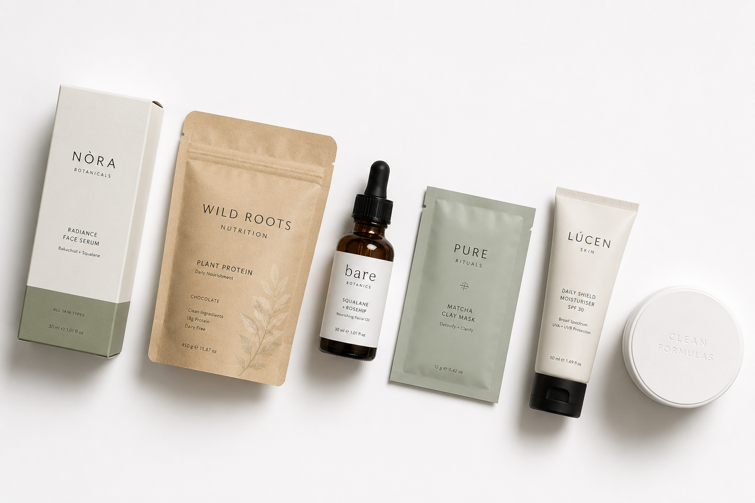
.png)
How to Choose the Right Packaging Style for Your D2C Brand
The right style comes from answering four questions honestly.
1. What does my category already look like? Visit a BigBasket category page or a modern trade shelf. What is the dominant style? That is your category convention. You need to be recognizable enough to be found, but distinct enough to be chosen. If everyone uses kraft and botanicals, the question is not whether to use them; it is what you add or remove to stand out within that system.
2. What price point am I defending? Below INR 500: warmth, energy, and clear value signals matter more than restraint. Above INR 1,500: restraint, material quality, and precision signal the price is justified. Between INR 500 and INR 1,500: this is the most contested zone, where the style decision has the highest stakes. Most brands lose differentiation here because they try to look premium without committing to the choices that make packaging actually read as premium.
3. What channel will my customer first see this in? A pack optimized for modern trade shelf presence (bold, color-blocked, readable at 2 meters) may perform poorly as an Amazon thumbnail. A pack designed for D2C gifting (structural, dark, textural) may arrive damaged through quick commerce. Your primary channel should drive the style decision, not your secondary one.
4. What does my SKU count require? A single hero product can carry a structural or illustrative style more easily than a 20-SKU range. A growing range needs a style system that scales, a color-coding logic, an illustration framework, and a typographic hierarchy that can be applied consistently across new products without requiring full redesigns
.png)
The Mistake That Kills Packaging Style Decisions
The most common mistake: picking a style in a meeting room, on a 27-inch monitor, in perfect lighting, without looking at competitors.
Before you commit to a packaging style, put your shortlisted design on a shelf, photograph it next to your 5 nearest competitors. Resize it to 100x100 pixels and look at it as a thumbnail. Print it on the actual substrate you plan to use and look at it under fluorescent retail lighting.
If the style reads clearly and distinctly in all three contexts, it is working. If it disappears in any of them, the style needs adjustment before you go to print.
Jellypop's packaging design process includes shelf context and thumbnail reviews as standard, because these are the tests that matter, not the ones most designers run.