.png)


How Packaging Impacts Ecommerce Conversions: The D2C Founder's Complete Guide
Most D2C founders spend their time and budget optimising ads, conversion rate, and product pages: and treat packaging as something to finalise once, early on, and not revisit. But packaging is the one asset that shows up at every single stage of the buying journey: the thumbnail that earns the click, the product page image that builds trust, the box that arrives at the door, and the unboxing moment that decides whether someone buys again.
Every time a shopper opens Nykaa, BigBasket, Amazon India, or Blinkit, your packaging sits in a lineup of 8 to 20 competing products on the same screen. No salesperson, no explanation, no second chance. The shopper scrolls, clicks, or skips in under 3 seconds: and packaging heavily influences that decision.
At Jellypop, we think founders who treat packaging as a one-time design deliverable are leaving growth on the table. Packaging is one of the strongest purchase-decision signals across ecommerce, quick commerce, and retail: and for skincare, beauty, wellness, FMCG, food and beverage, and personal care brands especially, it's a system that affects click-through rate, customer acquisition cost, repeat purchases, and overall revenue efficiency.
This guide breaks down exactly how packaging affects your ecommerce conversion funnel, using a simple framework, and what to fix if it's costing you sales.
The 4-Layer Packaging Conversion Model
Packaging touches every stage of the D2C ecommerce journey, not just the purchase moment. We call this the 4-Layer Packaging Conversion Model:
- Layer 1: Thumbnail: The listing image is packaging. If it doesn't stop the scroll, no one clicks.
- Layer 2: Product Page: The hero image is packaging. If it doesn't communicate value, quality, and trust within seconds, the shopper leaves.
- Layer 3: Unboxing: The physical packaging a customer receives either reinforces their purchase decision or creates doubt. The mailer box, the tissue, the insert: these determine whether someone shares an unboxing video or quietly requests a return.
- Layer 4: Advocacy: Packaging that's distinctive, well-made, or has a story gets photographed, shared, and recommended. Packaging that looks like everything else gets forgotten.
Packaging isn't the last step of the ecommerce experience: it's present, and doing work, at every step. The rest of this guide goes through each layer.
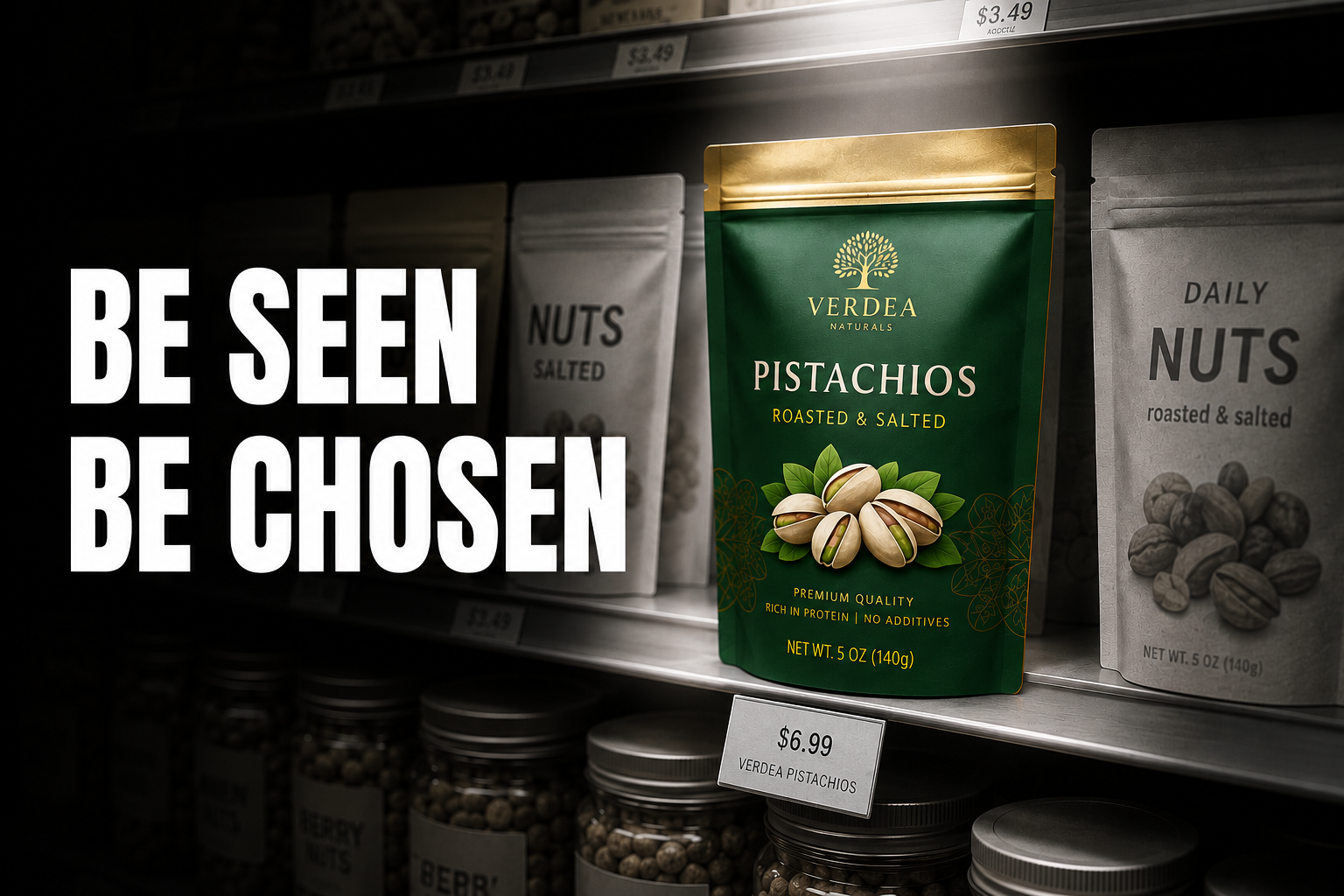
Layer 1: The Thumbnail: Where Most D2C Brands Lose the Click
The listing thumbnail is arguably the highest-leverage packaging touchpoint in ecommerce today. On Nykaa, BigBasket, and Amazon India, your main product image appears at roughly 200x200 to 300x300 pixels on desktop, and smaller still on mobile. On quick commerce apps: Blinkit, Zepto, Swiggy Instamart: thumbnails are often even smaller, sometimes closer to 80–100 pixels.
This matters more today than traditional shelf visibility for a simple reason: shopping behaviour has shifted to mobile, and quick commerce has compressed the decision window to roughly 8–10 seconds per category scroll. A shopper isn't walking down an aisle and picking products up: they're scrolling a grid of small images and deciding, almost instantly, what's worth a second look.
At thumbnail scale, most packaging fails. Here's why:
- Too much text on the front of pack. When the label hierarchy is designed for 30cm shelf distance, a smaller ecommerce image becomes unreadable. Product name, claim, and brand mark collapse into visual noise.
- Low contrast packaging. Pastel or muted colours that look premium on shelf lose presence against white ecommerce backgrounds. The product disappears into the page.
- No single dominant visual anchor. Packaging that tries to communicate too many things at thumbnail scale ends up communicating nothing. The eye needs one place to land: a colour block, a number, an icon, or a brand mark.
- Generic category aesthetics. When every competitor uses white labels with green accents, a product using the same visual language is hard to spot at thumbnail scale, regardless of how good it looks up close.
What thumbnail-optimised packaging does differently:
- Uses a dominant, ownable brand colour as the background: not just a coloured stripe or accent
- Carries the product name in a type size large enough to be legible at 200px width
- Leads with one primary claim, not three: "10% Vitamin C" reads; "10% Vitamin C + Niacinamide + Hyaluronic Acid" doesn't
- Has a front-of-pack hierarchy designed for small-screen recognition first, shelf presence second
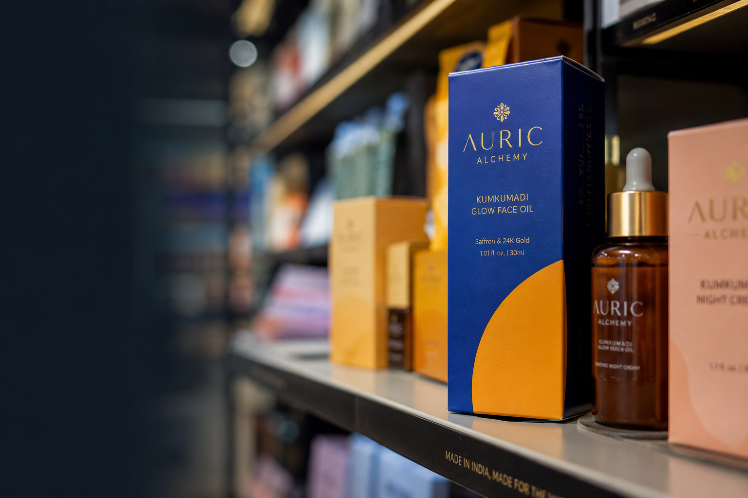
Indian brand example: MCaffeine built its packaging around saturated, single-colour backgrounds: neon yellow, bold green, bright orange: as the primary visual identifier. At thumbnail scale on Blinkit or Amazon, a shopper can often recognise an MCaffeine product by colour alone, before reading the name. That's a deliberate piece of conversion design, not just an aesthetic choice.
See our guide to best colours for skincare packaging to understand how MCaffeine's colour territory decision was made
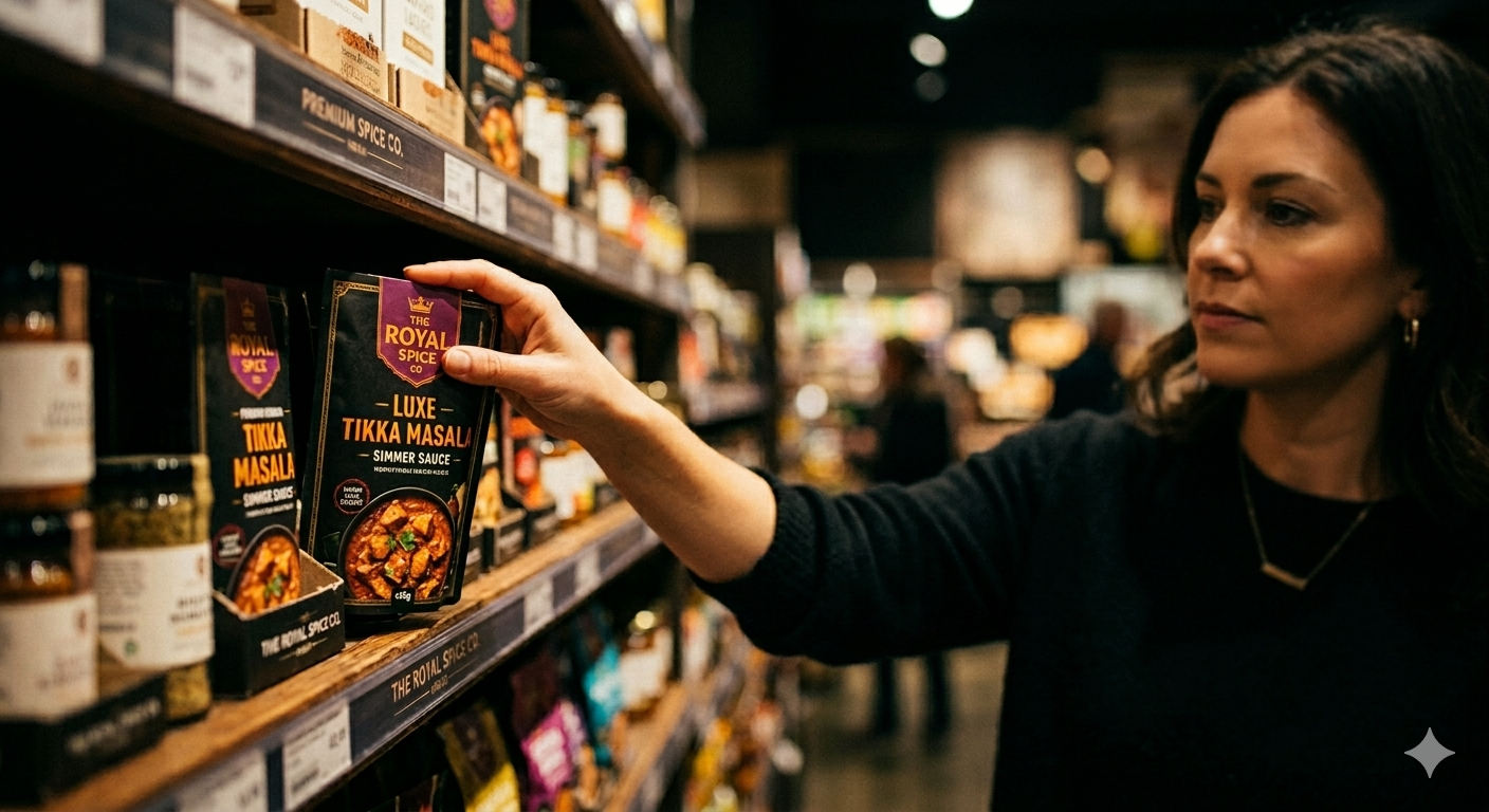
Layer 2: The Product Page Hero: Where Trust Is Built or Broken
A shopper who clicks through to the product page has already shown some intent: they're considering the purchase. The product page hero image, almost always a front-of-pack shot, now has two jobs:
- Confirm the quality signal the thumbnail suggested
- Give the shopper enough information to feel the price is justified, without needing to read the full description
Most Indian D2C brands underperform here for three reasons:
- Photography that hides the packaging. Lifestyle shots or renders: angled views, soft lighting, props: can look beautiful but obscure the label information a buyer needs. Shoppers on Amazon India and Nykaa generally want to read the label before they buy.
- Cluttered front of pack. When the product page hero is essentially a label shot, a cluttered label becomes friction. If a shopper can't find the key claim, dosage, or main ingredient within a few seconds, the effort of reading pushes them away.
- Inconsistent visual quality across SKUs. When a brand's product images use different photography styles, lighting, and backgrounds across its range, the brand can come across as less established: even when the products themselves are excellent.
Clear, well-organised packaging reduces the mental effort needed to evaluate a product, which directly increases purchase confidence. This is true whether the brand leans on an ingredient-first approach (leading with what's inside and at what concentration) or a benefit-first approach (leading with the result the product delivers): what matters is that one message is clearly dominant, with a defined claim hierarchy underneath it.
What high-converting product page packaging does:
- Front-of-pack follows one dominant claim hierarchy: Brand → Product Name → Key Claim → Key Ingredient
- Label information is structured for quick scanning, not paragraph reading
- Typography contrast is high enough to stay legible in a well-lit photograph at around 1000px
- The packaging's material finish and label quality visually support the price point before the shopper reads the description
Indian brand example: Minimalist built its product page approach around label legibility. The ingredient percentage, shown in large, high-contrast type against a white label, functions as the hero image for every SKU. A shopper knows what's in the product and at what concentration before scrolling to the description: the packaging does the selling, and the product page copy simply confirms it.
The founder takeaway: better packaging reduces cognitive load and increases purchase confidence: and that confidence is what turns a click into an add-to-cart.
Layer 3: The Unboxing: Where Repeat Purchase Is Decided
The physical packaging a customer receives at their door is their first tangible encounter with a brand promise they bought based on a screen.
If the physical product doesn't match the quality signal the photography suggested, a trust gap opens up: and that gap is often what drives returns, lower ratings, and a missed reorder.
For D2C brands in India, this stage plays out across three packaging layers:
Primary packaging (the product itself):
- Material finish needs to match the price point: a INR 599 serum in a thin plastic bottle with a sticker label can create disappointment regardless of how good the formula is
- Closure quality, pump mechanism, and dispensing experience are part of the packaging experience and influence whether someone reorders
- Any noticeable gap between how the product looks in photos and how it looks in hand reduces trust
Secondary packaging (the outer box or mailer):
- Branded mailer boxes and shipper boxes extend the brand experience through the delivery moment
- An unboxing that reveals branded tissue, an insert, or a personal note can become a natural moment someone wants to share
- A plain brown box for an INR 800+ premium product is often a missed opportunity to reinforce that positioning
The insert: a practical, often underused tool:
A well-designed insert is one of the most cost-effective things a D2C brand can add to a package. Some practical formats worth considering:
- QR codes linking to usage tutorials, ingredient deep-dives, or a "how to use" video
- Founder notes that add a personal touch and reinforce the brand's voice at a high-attention moment
- Loyalty offers: a discount code or early access offer for the next order
- Cross-sell cards introducing other products in the range, with a reason to try them
- Product education inserts that explain how to get the best results, reducing the chance of a customer giving up on a product too early
These small additions can meaningfully shape what happens next: a customer who understands how to use a product correctly is more likely to see results and repurchase; a referral code in the box can turn a single sale into a new customer at near-zero acquisition cost; and an insert that's well-written and on-brand reinforces trust at the exact moment a customer is paying the most attention to the brand.
Indian brand example: The Whole Truth uses its packaging insert and inner box design to extend its "radical transparency" positioning beyond the label itself. The insert continues the ingredient story, anticipates likely questions, and reinforces the purchase decision in the brand's direct tone of voice: creating an unboxing experience that feels consistent with what was promised on the product page, which is the kind of consistency that tends to support good reviews and repeat orders.
See our guide to how to build a memorable D2C brand to understand how this consistency between digital promise and physical delivery is the mechanism behind the repeat purchase rates brands like The Whole Truth have built.
Layer 4: Advocacy: Packaging as an Acquisition Channel
In Indian D2C, organic sharing of unboxing moments: on Instagram Stories, YouTube Shorts, and WhatsApp groups: plays a role in how some shoppers, particularly in beauty, skincare, and wellness, discover new brands.
Packaging that gets shared tends to have a few things in common: it's visually distinctive enough to feel worth showing someone else, the secondary packaging has some story or detail worth pointing out, it looks good enough to give as a gift, and the unboxing sequence itself: outer box, tissue layer, product reveal: feels designed for a vertical video format rather than just functional.
Indian brand example: Nykaa and several premium brands in its portfolio consistently design unboxing experiences with branded tissue, ribbon, and product placement suited to Instagram Stories. The result is organic unboxing content that supports brand discovery without additional paid media spend. For D2C brands in the INR 50 lakh to INR 5 crore revenue stage, a well-designed secondary packaging system is often one of the higher-return packaging investments available: turning routine deliveries into small moments of brand exposure.
The 6 Packaging Mistakes That Hurt Ecommerce Performance
Understanding how packaging affects ecommerce is useful. Knowing which specific mistakes to fix is more useful.
Mistake 1: Designing packaging for shelf first, screen second.Most packaging briefs describe a retail environment, but most Indian D2C revenue comes from ecommerce and quick commerce. Design for the 200px thumbnail first, then check it still works at shelf scale: not the other way around.
Mistake 2: Too many claims on the front of pack.A shopper's eye can really only register one claim in a quick scroll. Every additional claim dilutes the impact of the main one. Pick one and make it dominant.
Mistake 3: Material finish that doesn't survive the camera.Packaging that looks premium in person but photographs as flat or dull can quietly hurt product page performance. Matte soft-touch finishes, embossing, and spot UV are choices worth testing through product photography before committing to a full production run.
Mistake 4: No visual continuity between primary and secondary packaging.When the product looks premium but arrives in a plain mailer, some of the trust built through the rest of the funnel can be undone at delivery. Secondary packaging should be part of the brand system from the start, not an afterthought.
Mistake 5: SKU images that are inconsistent across the product range.Different lighting, backgrounds, and styling across SKUs can make a brand look less established to an ecommerce shopper. Consistency in product imagery signals that a brand has been thought through; inconsistency suggests the opposite.
Mistake 6: Skipping the thumbnail test before production.It's common for packaging to be approved based on a large render or a physical sample, with no one checking what it actually looks like as a small thumbnail on a marketplace or quick commerce app. By the time this gets noticed, the packaging is already in production. Validating thumbnail performance: on Blinkit, Zepto, Amazon, and Nykaa listing sizes: before finalising artwork can prevent a costly redo later.
How to Audit Your Packaging for Ecommerce Performance
Before your next product page refresh or packaging redesign, run through these checks:
- Thumbnail test: Export your front-of-pack image at 200x200 pixels. Is the brand visible? Is the product name legible? Is there one dominant visual anchor?
- 5-second test: Show your product page hero image to someone unfamiliar with the brand for 5 seconds, then ask what the product is, what it does, and roughly what it costs. If they can't answer all three, the hierarchy likely needs rework.
- Physical match test: Compare the product a first-time customer receives against your product page photography. Does the physical product match or exceed the quality signal the image sets? If not, either upgrade the packaging or adjust the photography to better reflect reality.
- SKU consistency test: Line up all your product page images side by side. Do they look like one brand, or like five different brands sharing a category?
- Unboxing test: Film yourself unboxing one of your own products as a first-time customer would. Would you post this? Would you share it? If not, what's missing?
- Quick commerce test: Place your product thumbnail next to 10 competitors from a Blinkit or Zepto search. Can you spot your own product within 2 seconds?
- Screenshot test: Take a screenshot of your product on a marketplace listing page. Does your packaging create a visual break from the rest of the page, or does it blend into the category around it?
Most packaging projects fail not because the design is bad, but because they're treated as one-off design projects rather than ongoing conversion systems. A logo and label that look good in a presentation deck don't automatically perform well on a Blinkit thumbnail, a Nykaa listing, a retail shelf, and inside a mailer box: those are four different jobs, and most packaging is only ever tested against one of them.
Jellypop helps skincare, beauty, wellness, FMCG, food and beverage, and personal care brands build packaging systems that are designed to perform across ecommerce, quick commerce, retail shelves, unboxing, and brand recall: from the first brief, not as an afterthought. If you're also working on your packaging colour strategy, brand identity, or want to see our packaging design process and case studies, those are good next steps. [See our packaging work →]