.png)


Why Packaging Matters for Food Brands in India
A shopper decides whether to pick up your product or walk past it in three seconds or less: before they read the ingredient list, the nutrition panel, or your brand story. That single decision is often the difference between a sale and a missed one.
For Indian food brands selling on shelf, Amazon India, BigBasket, or Blinkit, packaging isn't a creative add-on. It's one of the most direct levers a brand has over its own sales. The brands growing fastest in clean food, nutrition, and snacking tend to understand this. The ones stuck at the same revenue for a couple of years often share the same problem: a product that's better than it looks.
This post looks at what packaging needs to do across each sales channel, what a few well-known Indian food brands have done well, and the specific mistakes that tend to cost founders shelf placements and repeat purchases.
Packaging Does a Lot of the Selling Before You're in the Room
A shopper at a modern trade retailer like Reliance Smart or DMart walks past around 200 products in 90 seconds. At that pace, no one is reading labels: people are pattern-matching on colour, shape, and visual hierarchy. Your packaging's job in that moment is to interrupt that pattern long enough to earn a pick-up.
For D2C food brands, the stakes are higher still. There's no distributor rep briefing store staff, and no years of brand recall to fall back on. There's a pack sitting next to four competitors, and it either earns the pick-up or it doesn't.
Some industry research on Indian D2C consumers has pointed to packaging as one of the strongest first-purchase triggers for food and nutrition products: often ahead of price and brand familiarity. Whether or not the exact numbers are cited, the underlying pattern matches what most founders observe directly: the first purchase tends to be earned through how the product looks, and the repeat purchase through how it performs.
What Food Packaging Needs to Do Across Each Sales Channel
Food brands in India now operate across at least four different visual environments at once, and each one has its own rules. Most packaging is designed with one of these in mind and quietly fails in the others.
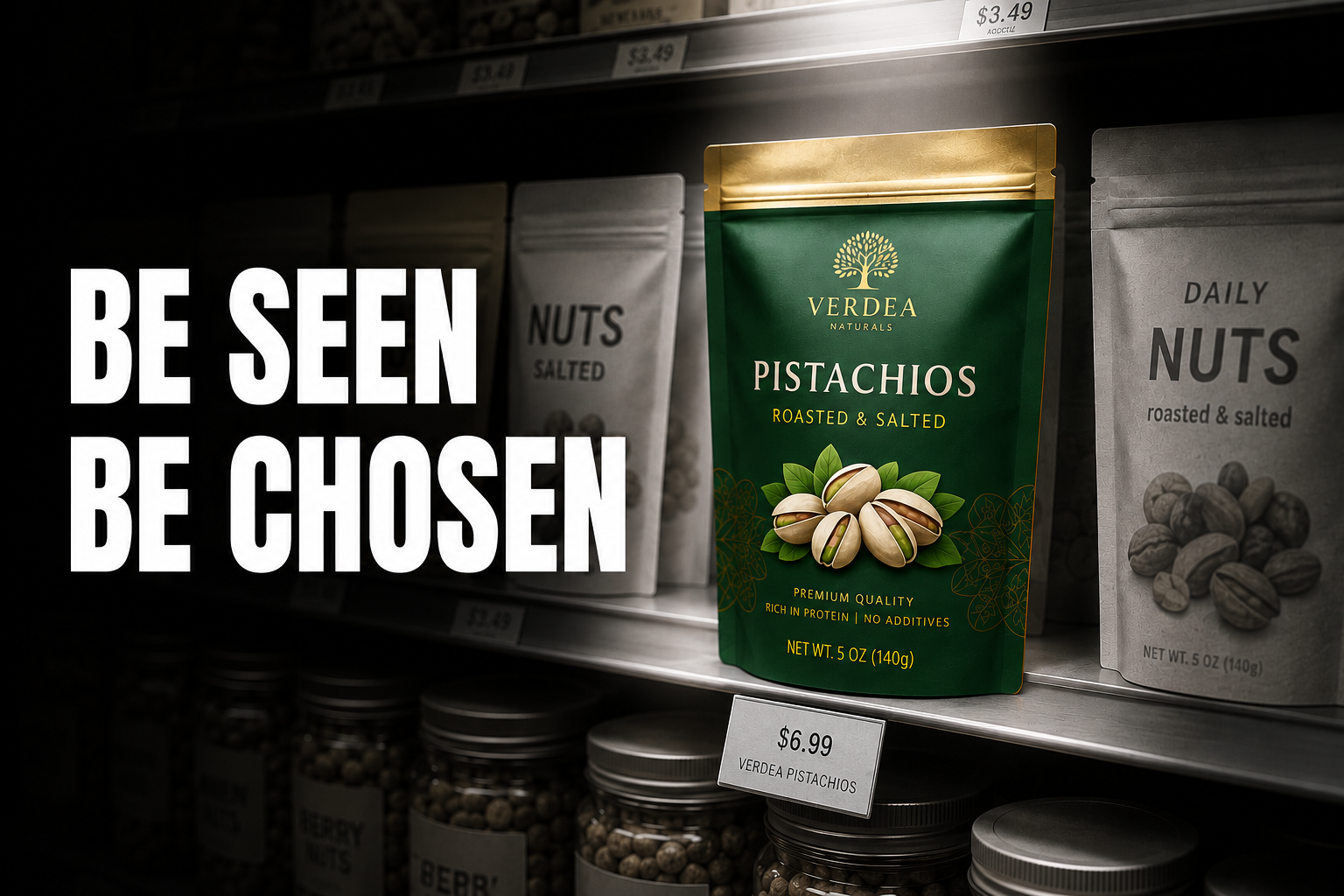
Modern Trade Shelf (DMart, Reliance Smart, Spar, Nature's Basket)
On a physical shelf, packaging needs to do a few specific things: the brand name should be readable from about 1.5 metres away, there should be a clear hero claim or product descriptor in the top third of the pack, the colour system should stand apart from the category rather than blend into it, and the pack shape needs to sit, stack, and face the shelf without looking awkward.
Retail buyers at modern trade chains often decide within the first minute of a pitch meeting whether packaging earns shelf space. The question they're really asking isn't "does this taste good": it's "will this stop a shopper walking past it." If the pack can't answer that visually, the rest of the pitch has less room to work with.
Amazon India and BigBasket Listings
On the digital shelf, the main product image has to carry the full story on its own: name, variant, hero claim, and quantity, all in one frame. The background needs strong contrast against the product: white or a bold colour: and the brand name should be readable at 200px without zooming in. Anything that reads as fine print on the physical pack tends to become visual noise here.
A common issue is brands using the same pack photography for digital listings as for print. The product looks strong in hand but disappears on a listing page next to competitors. On Amazon India and BigBasket, the main image isn't just packaging photography: it's doing the job a salesperson would do in a store.
Blinkit, Zepto, and Swiggy Instamart (Quick Commerce)
At the smallest scale: roughly 80–100 pixels wide: packaging needs high contrast, one dominant visual element per SKU (a single ingredient, a shape, or a bold colour block), and near-instant category recognition, with no reliance on small text to explain what the product is.
Quick commerce has become a major channel for D2C food brands in Indian metros, and for categories like nutrition bars, healthy snacks, and supplements, it's increasingly comparable in importance to Amazon India for many brands. If a product doesn't hold up at thumbnail scale, it's effectively invisible on one of the fastest-growing food retail channels in urban India.
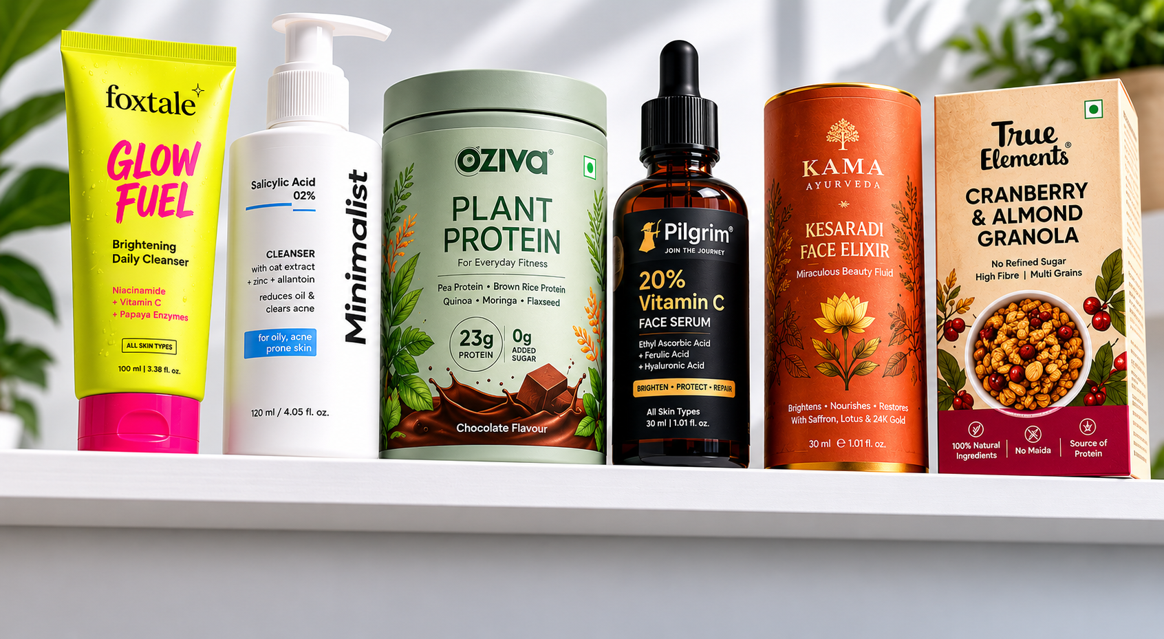
Your D2C Website and Social Channels
On owned channels, the expectations shift again: pack photography should match the brand's overall aesthetic rather than look like a generic studio shot, packaging colours should feel consistent with the website palette and social feed, and product images need to work both as website hero images and as Instagram grid tiles. Across a full SKU range, the packaging system should feel like one coherent brand, not a collection of separate decisions.
When someone discovers a product on Blinkit and then visits the website, they're expecting some visual continuity. If the packaging feels minimal and clinical but the website feels warm and lifestyle-driven, that mismatch creates a small but real moment of friction: and friction tends to reduce conversion.
What Good Food Packaging Looks Like: Three Brand Examples
The Whole Truth: Transparency as the Design Itself
The Whole Truth sells nutrition bars in a category full of vague claims about energy, health, and "natural" ingredients. Their approach was to print every ingredient on the front of the pack, in plain English, in large type: no benefit claims, just the contents.
This wasn't minimalism for its own sake. It was a way to earn the trust of label-literate consumers who'd grown sceptical of everything else on the shelf. The brand has built a loyal following that often points to this transparency as a specific reason for choosing the product over alternatives, and it's frequently cited as a case study for how a values-led food brand can scale in India without compromising on its core positioning.
The takeaway: in a category where everyone claims to be clean, showing it tends to build more trust than claiming it.
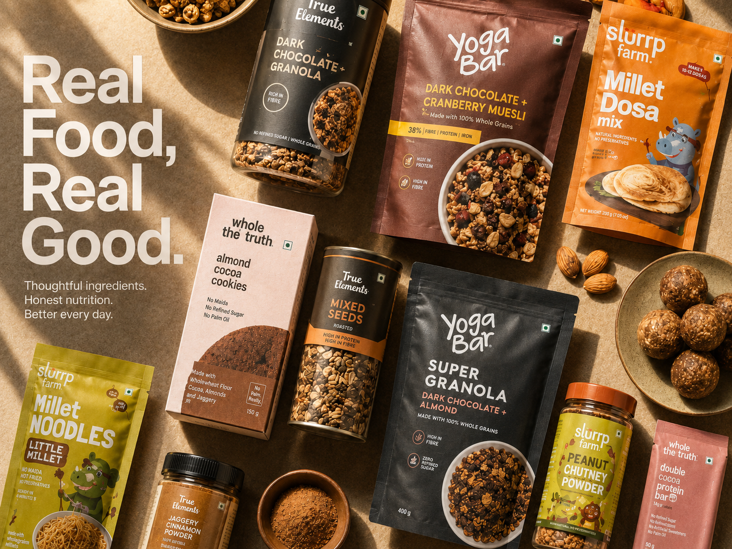
Yoga Bar: One Visual System, 40+ SKUs
Yoga Bar built a visual identity that communicates wellness without feeling clinical. A soft colour palette, clean typography, and natural texture photography carry a consistent story across more than 40 SKUs: from protein bars to oats to muesli: and every product clearly reads as part of the same family.
That consistency matters commercially. A customer who discovers Yoga Bar through one product recognises the brand instantly when they encounter a different variant elsewhere, whether on a shelf, a quick commerce app, or a friend's kitchen counter. Brand recall builds across the whole range rather than resetting with each new launch: which is part of why Yoga Bar has been able to grow into one of the more recognisable names in Indian healthy snacking, expanding into new categories without having to rebuild recognition from scratch each time.
The takeaway: a consistent visual system across SKUs compounds brand recognition over time, which makes each new product launch a little easier than the last.
Slurrp Farm: Designing for Two Audiences on One Pack
Slurrp Farm sells clean food for children, in a category where parents tend to be sceptical of health claims by default. The packaging uses bright, playful colours and illustrated characters that appeal to children, while the front-of-pack hierarchy leads with the specific reassurances that matter to parents: no maida, no refined sugar, no artificial colours.
Two audiences, one pack, one clear hierarchy. The design doesn't trade off the child's appeal (fun, colourful, engaging) against the parent's needs (clear trust signals). Slurrp Farm has used this approach to build a strong position in Indian retail and online kids' food, expanding across a wide range of products while keeping that same dual-audience hierarchy intact.
The takeaway: what you lead with on a pack, and what you support it with, is a strategic decision: not just a layout choice.
Five Packaging Mistakes That Cost Indian Food Brands Sales
1. Designing for print without checking how it looks on screen. A pack that looks great in a print proof can look quite different on Amazon, on Blinkit, or under harsh shelf lighting. It's worth checking packaging across all four environments: shelf, marketplace, quick commerce, and owned channels: before finalising anything.
2. Blending into the category. Using the same colours, fonts, and visual cues as everyone else in the segment means a product is, by default, competing mainly on price. If an energy bar's packaging looks like three others on the same shelf, there's little reason for a shopper to choose it over those alternatives.
3. An overcrowded front of pack. Not every claim, certification, benefit, and variant descriptor belongs on the front face. Leading with one thing, supporting it with one or two more, and saving the rest for the back label or website tends to work better than trying to say everything at once.
4. An inconsistent SKU range. When new variants each look like a different studio designed them, it can read as a sign of brand immaturity to both retail buyers and shoppers: even when each individual product is strong.
5. Treating FSSAI requirements as an afterthought. FSSAI labelling rules set minimum font sizes, mandatory information placement, and required disclaimers. Leaving these out of the initial design process often means redesigning a nearly-finished pack later, which costs both time and money.
Building FSSAI Compliance Into the Design Brief From Day One
Every food brand selling in India needs to meet FSSAI (Food Safety and Standards Authority of India) packaging requirements. These typically cover minimum font sizes for mandatory declarations (product name, net weight, batch number, expiry date, manufacturer address), the required format and placement for the nutrition facts panel, veg or non-veg symbol placement and sizing, the format for "Best Before" and "Manufactured On" dates, and allergen declarations in contrasting colour or bold type.
Agencies without food-specific experience sometimes treat these requirements as something to fit in after the design is mostly done. The result is often a finished pack that has to be reworked to accommodate mandatory information: disrupting the visual hierarchy that took weeks to get right.
A better approach is to bring FSSAI requirements into the design brief from the very first concept, so the creative work happens within those constraints rather than around them afterwards.
Is Your Packaging Holding Your Food Brand Back?
A few signs that packaging might be the issue:
- Retail buyers have asked for "better packaging" before agreeing to list the product
- Reviews are strong, but repeat purchases are low: customers like the taste, but the pack doesn't prompt a reorder
- The Amazon listing has a low click-through rate despite a competitive price
- The brand looks noticeably different across packaging, the website, and social channels
If any of these sound familiar, the issue usually isn't the product itself: it's the first layer a customer encounters before they ever get to try it.
Jellypop Design builds packaging for Indian D2C food and FMCG brands, with FSSAI-compliant label structures, dieline-ready files, and a visual system designed to work across shelf, quick commerce, and your website from day one.
Start a conversation at jellypop.design