.png)





Packaging Design Trends in India: What's Working on Shelf and Online in 2026
Packaging design trends in India are shifting faster than most founders realise. What converts on Amazon now fails on Blinkit (a quick commerce app that delivers groceries in 10-15 minutes). And what worked in modern trade, meaning large organised retail chains like supermarkets, gets ignored in a D2C Instagram reel.
The brands winning in 2026 are designing packaging systems that work across all four surfaces: shelf, screen, quick-comm thumbnail, and unboxing. If your packaging only solves one of these, it is already leaving money on the table.
Here is what is actually driving decisions right now, across skincare, food, and personal care.
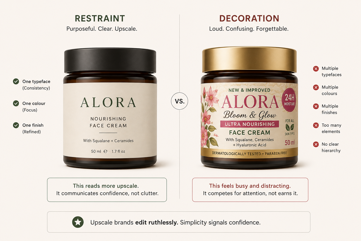
1. Purposeful Minimalism Has Replaced Generic Clean
A few years ago, "clean packaging" meant white backgrounds and thin fonts. Every brand in wellness, skincare, and clean food started looking identical. That era is over.
In 2026, the strongest Indian D2C packaging uses what designers call purposeful minimalism: stripping away everything that does not communicate value, and making every remaining element carry weight.
The Whole Truth is the clearest example, in the packaged food category. Their packaging lists every ingredient in plain English, no illustrations, no lifestyle shots. The whitespace is not laziness, it is the proof point: "we have nothing to hide" is communicated through layout, not words.
Their competitors use illustration and warm colours to suggest health. The Whole Truth uses radical typographic transparency to prove it instead. Minimalist (skincare) uses a near-identical logic in a different category: the ingredient percentage in large type is not just design, it is trust compressed into a label.
Across many skincare categories, brands with highly decorative packaging often struggle to communicate the same level of clinical credibility. If you are rebuilding your packaging in 2026, the question is not "how do we make it look cleaner?" It is "what single truth can our packaging tell that no decorative element can fake?"
Fix it: List the one fact about your product you would want a stranger to know in three seconds. Design your front-of-pack around that fact alone, and cut everything that does not support it.
See our guide to consumer psychology in packaging design for the psychological framework behind why purposeful minimalism builds credibility faster than decorative packaging, and how to apply that framework to your specific category.
2. Quick Commerce Has Completely Changed Thumbnail Design
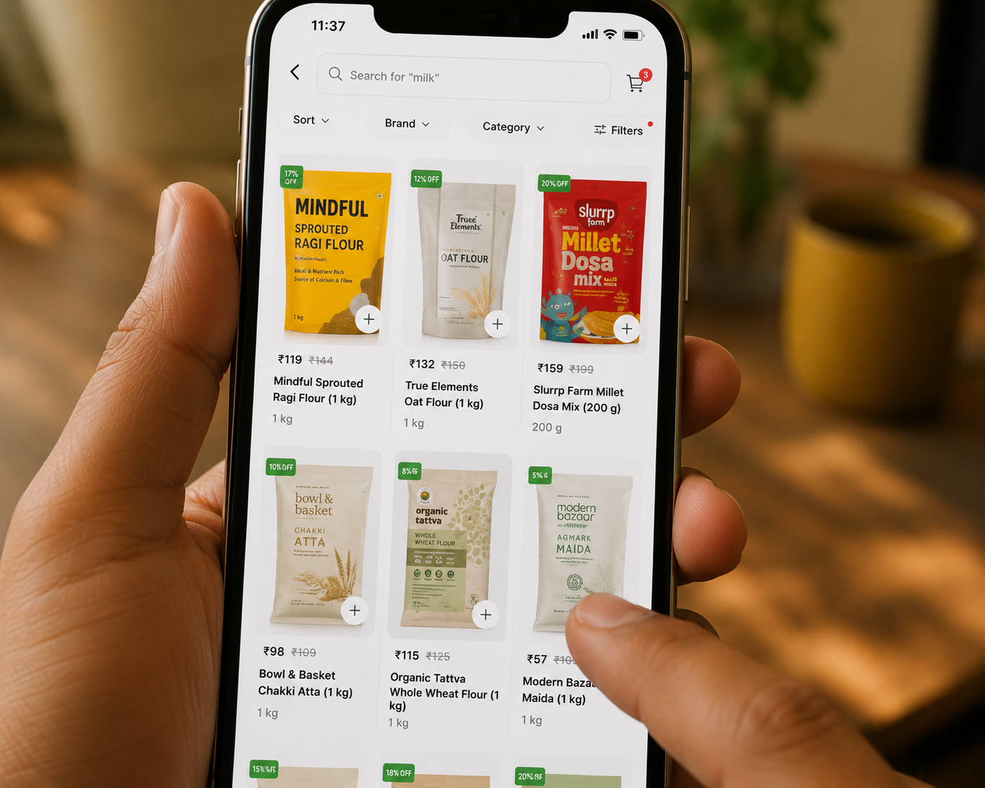
Blinkit, Zepto, and Swiggy Instamart are no longer secondary channels for most everyday packaged D2C brands. For categories like health drinks, snacks, and skincare, quick commerce now drives a growing share of D2C sales revenue, and the product thumbnail (the small preview image shoppers see while scrolling) is typically shown at around 80x80 pixels.
Packaging designed for shelf presence at eye level does not automatically translate to a winning thumbnail. The contrast ratios that pop under fluorescent retail lighting do not always hold on a mobile screen at 11 PM, and product name hierarchies built for a 30-centimetre viewing distance collapse at thumbnail scale.
The brands adapting fastest are building what can be called two-way functional packaging: one design system that works at shelf scale and at digital thumbnail scale simultaneously. MCaffeine's neon-dominant packaging, in the personal care category, is a strong case study here.
The bold background colours (yellow, green, orange) that felt aggressive on early retail shelves now function perfectly as thumbnail identifiers. A Blinkit shopper scrolling at speed can distinguish MCaffeine from a generic protein supplement in under half a second. That recognition at thumbnail scale is the result of a packaging system built with colour saturation and contrast as primary design constraints, not an accident.
Fix it: Export your packaging image at 100x100 pixels and check it against three questions. Can you read the product name? Can you identify the brand? Is there a dominant colour association? If the answer to any of these is no, adjust the design before you finalise print files, not after.
See our guide to ecommerce packaging ideas for startups for practical examples of how Indian D2C startups are building this two-way performance into their packaging brief from the first draft.
3. Tactile and Material Differentiation Is Becoming a Retail Buy Signal
India's large supermarket chains, stores like Reliance Smart and D-Mart, are seeing more D2C brands pitch every month, and their retail buyers are experienced at filtering. Packaging that looks good in a digital presentation document but feels generic in hand does not convert into a shelf-space agreement.
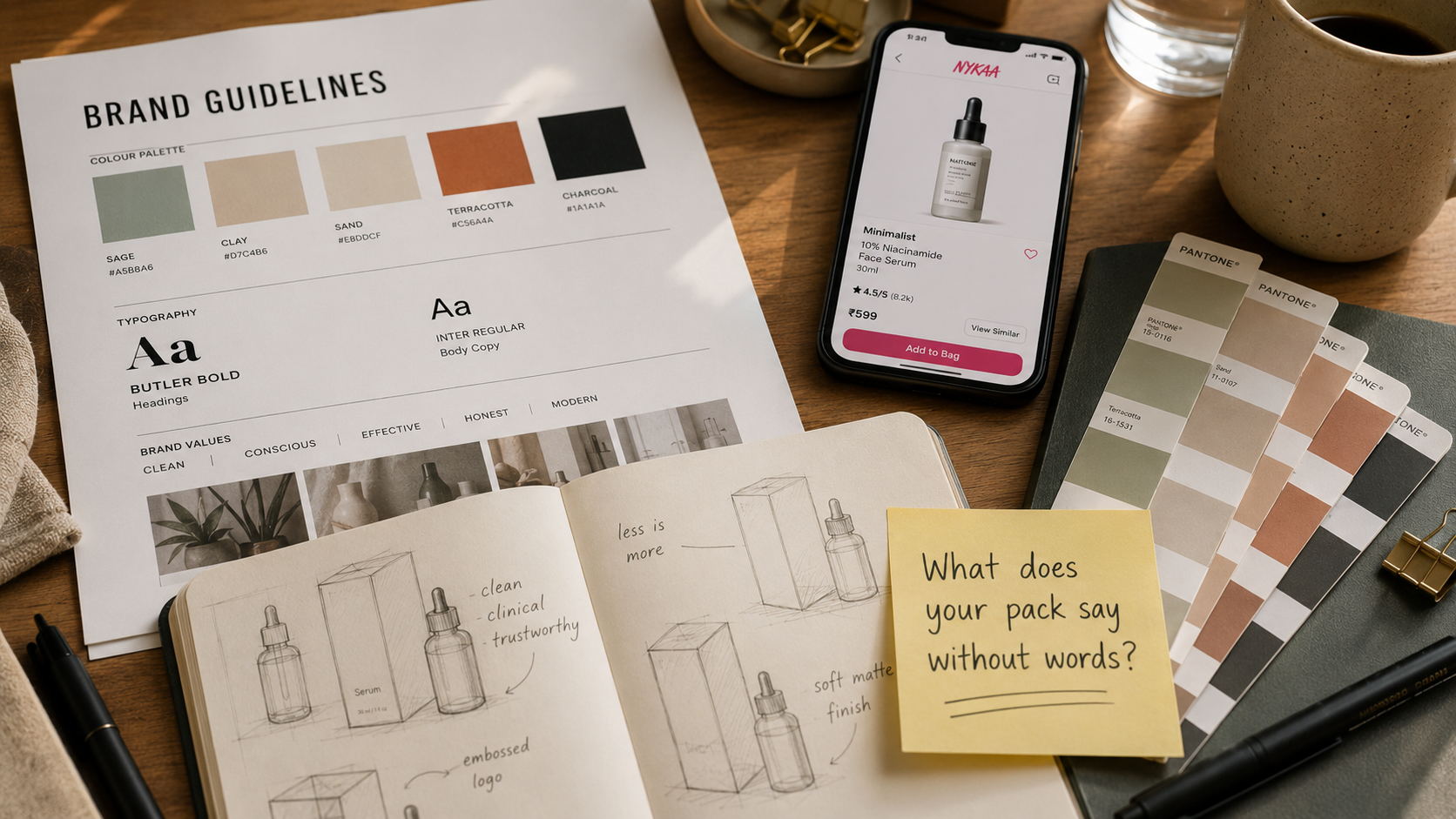
In 2026, tactile and material differentiation is a commercial differentiator, not just an aesthetic one. Soft-touch lamination (a matte, velvety coating), spot UV (a glossy raised-ink accent), embossed logos, and kraft paper exteriors are no longer premium-tier exceptions for brands pitching large retail chains at a mid-to-premium price point.
What is differentiated now: textured paper types, debossed patterns, and metallic foil details that serve functional legibility rather than decoration, plus packaging material choices that communicate the product's values before the consumer reads a word. This applies just as much to a snack pouch or a supplement tub as it does to a skincare jar.
Plum Goodness made a visible shift toward matte, soft-touch packaging across their skincare line in 2023-24. The shift was not just visual, it changed market perception without the brand changing its product recipes, price level, or marketing. Retailers reported it as a tactile upgrade that elevated perceived quality to a tier where Plum could hold shelf space next to international imports without looking outclassed.
Fix it: Hold your packaging next to your closest premium competitor's and ask what a buyer concludes in the first two seconds of physical contact. If the honest answer is "nothing distinctive," your material selection is a branding problem worth fixing before your next print run.
See our guide to premium packaging design for the material and finish scope that goes into a retail-ready brief.
4. India-Rooted Aesthetics Are Replacing Generic Global Minimalism
Indian D2C brands spent much of 2019-2023 chasing European or Korean aesthetic references. The result was a group of Indian brands that looked like they were designed in Berlin or Seoul, with no visual connection to the consumer they were selling to.
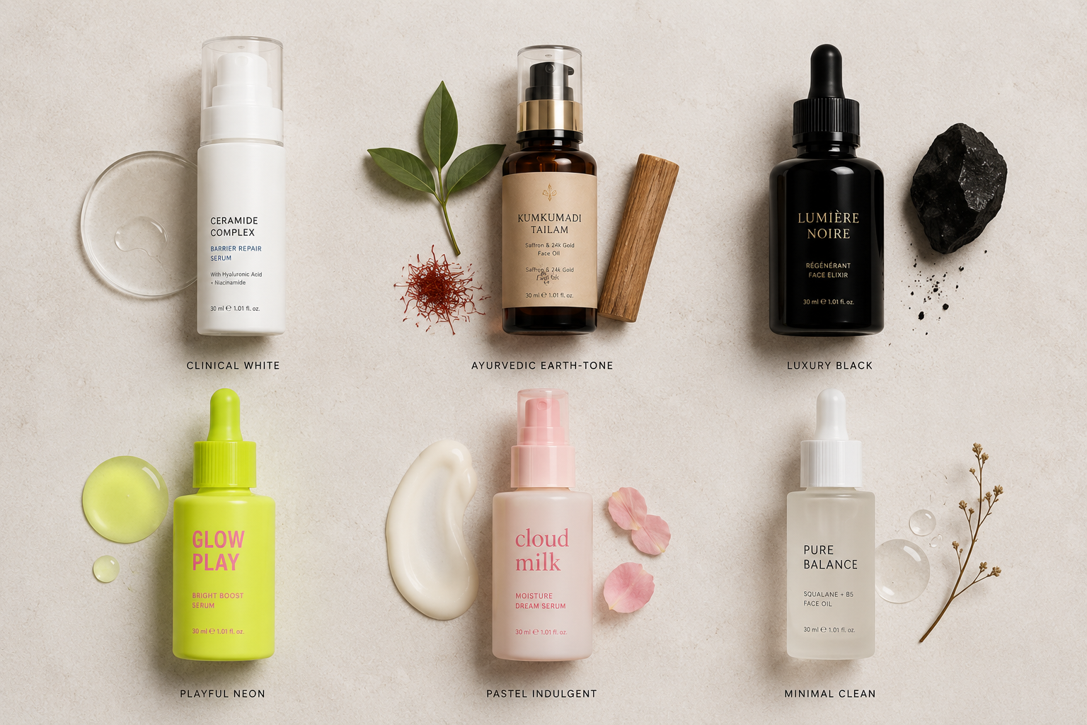
2025-26 is seeing a correction, though not a retreat into generic "ethnic" clichés like paisleys, temple motifs, or lotus patterns. What is emerging instead is more sophisticated: design systems that draw on Indian colour intelligence, material culture, and visual storytelling traditions while still presenting as premium and modern.
Pilgrim built its identity on Korean beauty science while keeping its packaging visuals completely adapted for Indian skin tones and Indian beauty ritual language. The result is a brand that feels internationally sophisticated without being culturally alien, because the colour palettes draw from Indian skin-tone resonance rather than Korean cosmetics retail norms.
Nykaa's own spin-off beauty brands have moved deliberately toward earth tones, Indian-origin ingredient visual cues, and typography that feels both premium and familiar to the Indian beauty buyer. This is not nostalgia, it is a strategic recognition that Indian D2C buyers in 2026 want premium without feeling foreign. The same logic applies well beyond beauty, in food and home categories drawing on Indian spice colour palettes or textile patterns.
Fix it: Swap at least one reference on your moodboard from a Scandinavian or K-beauty source to an Indian textile, artist, or colour tradition, and test whether it still reads as premium to your target buyer.
See our guide to storytelling through packaging design for how Indian brands are using narrative, cultural reference, and founder voice as the design layer that makes packaging feel rooted without feeling generic.
.png)
5. Sustainability Is Moving From Marketing Claim to Material Choice
The conversation has moved. It is no longer "should we use sustainable packaging?" It is "which sustainable packaging choice communicates our values without adding cost that the consumer will not accept?"
For Indian D2C brands, this is a real operational tension. Sugarcane paper, PCR plastics (post-consumer recycled plastic), and glass alternatives carry cost premiums that affect margins, especially for brands still in an early growth stage. But for brands positioned at a premium price tier, packaging that uses obviously virgin plastic now creates a trust gap with the consumer who has already read the brand's sustainability claims online.
Yoga Bar moved to recyclable packaging and communicated the shift explicitly on the pack, turning a production decision into a brand proof point. The messaging was not "we use eco-packaging," it was integrated into the ingredient story, making sustainability feel like part of the product's health positioning rather than a separate corporate claim.
The practical framework for D2C founders in 2026: prioritise sustainable material choices for external packaging (box, wrapper, bag) where the consumer sees it most. Inner packaging (tray, liner, sachet) can optimise for product safety over sustainability without damaging perception, because most consumers do not inspect inner packaging with the same scrutiny.
See our guide to best packaging materials for premium brands for a breakdown of which sustainable material choices deliver the strongest premium signal, and which create cost premiums that a lower price tier cannot absorb.
6. Product Consistency Across Different Flavors and Sizes Is Now a Brand Multiplier
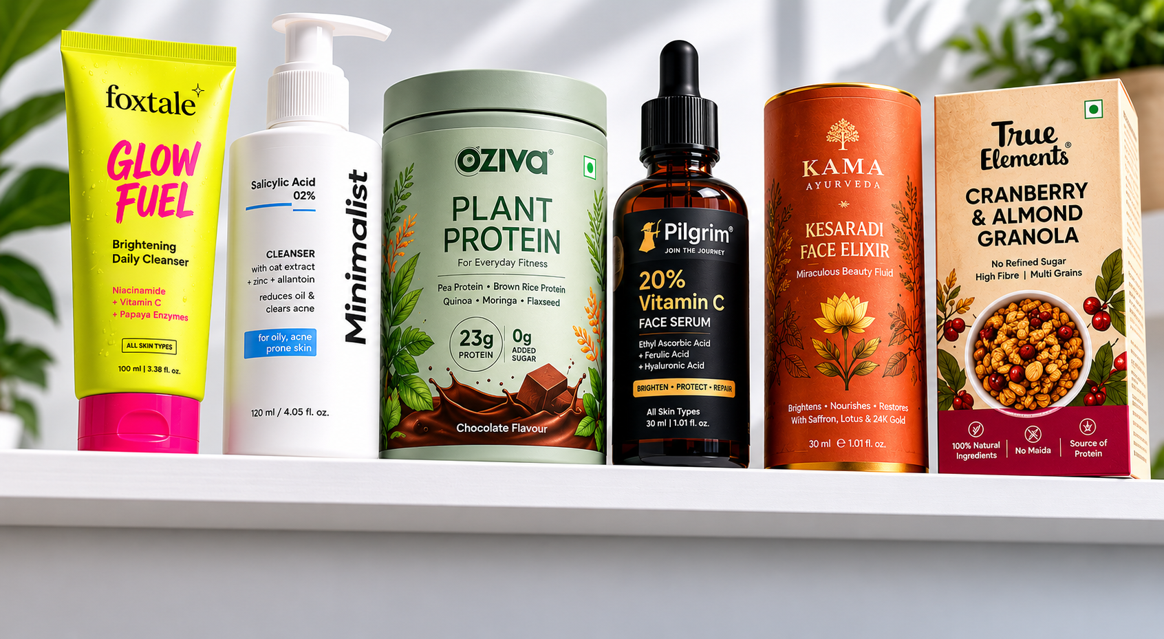
One of the clearest differentiators between brands that scale and brands that plateau is having layout rules for different product variants. Brands that launch with 3 variants and then add 7 more over 18 months, each with a slightly different visual treatment, create what retail buyers call visual clutter on shelf: a dedicated shelf space that looks like four different brands share the same category.
Mamaearth's evolution is instructive here. Their early product range had visible inconsistencies across their vitamin C, onion oil, and moisturiser lines, and by 2022-23 they rebuilt their visual system with a tighter typographic hierarchy, a defined illustration style, and a consistent colour-coding logic across categories. The same discipline applies whether you sell skincare, snacks, or supplements.
The result: the brand holds a full dedicated shelf space in large supermarket chains, and every product variant reads as Mamaearth from three metres away. For D2C founders adding variants, the brand structure question must be answered before the design brief starts: are new variants in the same family, same design system, different accent colour, or a separate line with a different design language unified only by logo?
Fix it: Before your next variant launch, write down the one rule that will not change between products, whether that is bottle shape, label layout, or logo placement, and hand that rule to your designer as a constraint, not a suggestion.
See our guide to brand consistency across D2C and offline retail for the full framework on keeping one packaging system intact as your product range grows.
What This Means If You Are Designing Packaging Right Now
The six trends above have a common thread: packaging in India in 2026 must carry more commercial weight than it ever has. More sales platforms mean more contexts to design for, and smarter consumers mean less tolerance for visual dishonesty.
Better-funded competitors mean your packaging cannot be "good enough," it has to be category-defining. The brands that win at shelf and online are not the ones with the biggest budgets, they are the ones who made clear design decisions early and built them into a system.
For a view of where these trends are heading beyond 2026, see our guide to the future of D2C branding in India.
If your packaging was designed for a stage your brand has outgrown, or built without a retail buyer or quick-comm platform in mind, now is the time to address it: not after the next funding round, before the next retailer meeting.
Jellypop designs packaging systems for funded Indian D2C brands, built for shelf, screen, and quick commerce from day one. [See our packaging work →]