.png)





Packaging Checklist for Startups: 12 Things to Get Right Before You Launch
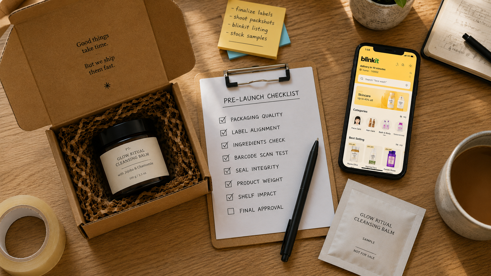
The most expensive packaging mistakes do not happen at the design stage. They happen after 10,000 units are printed, when a founder discovers the label is missing a mandatory FSSAI declaration (the food safety label requirements set by India's Food Safety and Standards Authority), the structure is too fragile for courier delivery, or the thumbnail looks like noise on a Blinkit listing. At that point, the cost is not a design fee. It is a reprint bill, a delayed launch, and inventory sitting in a warehouse that cannot ship.
This checklist exists to prevent that. It covers every decision you need to lock down before your first production run, in the order those decisions need to be made. Get this right once, and your packaging will not need a redesign for the next two years, whether you're shipping skincare, snacks, or supplements.
What Should Be on Your Packaging Checklist?
Before you brief a designer or get a quote from a printer, four things need to be settled: who you are selling to, where they will buy from you, what the product physically requires, and what budget per unit you can sustain at scale. Skip any one of these and the checklist below will cost you twice, once now and once when you redo it.
The channel question is the one most founders underestimate. Packaging requirements shift dramatically depending on where the product is sold.
Blinkit and Zepto: Your pack needs to be identifiable at 80 to 100 pixels, the size your product appears at in a scrolling app grid. Colour contrast, a single dominant brand mark, and one readable primary claim are the only things that survive at that scale. Fine illustration, multi-line copy, and light-weight typography all fail.
Amazon and D2C website: Thumbnail performance still matters, but you also have product image real estate: lifestyle shots, infographics, detail images. The pack needs to photograph cleanly on a white background and carry enough visual quality to justify its price tier in a static image.
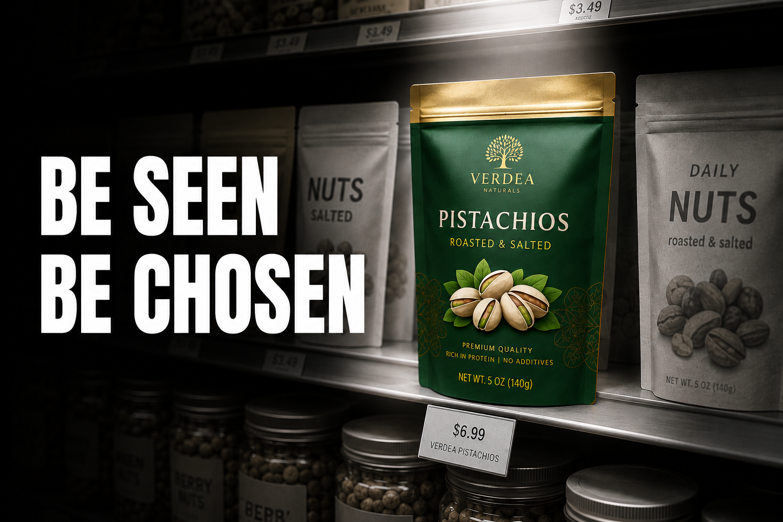
Modern trade (D-Mart, Reliance Smart, Spar): Shelf presence at 1 to 2 metres is the primary brief. Colour blocking, structural distinction, and front-panel hierarchy that reads under fluorescent lighting next to competitor products are what matter here.
Designing one pack and hoping it works across all three channels is how startups waste their first packaging budget. Decide your primary channel first, design for that, then confirm the design does not fail in the secondary channels.
This decision applies the same way whether you're packaging a beverage, a coffee SKU, or a personal care product: identify your primary channel before any design work begins, and revisit this decision before every new SKU launch.
Pre-Design Checklist: Get the Strategy Right First
Before a single dieline (the technical template that shows where a label or box gets cut, folded, and printed) gets drawn, confirm the following four points.
1. Target shelf, not just target customer.
Quick commerce, modern trade, and D2C-only each demand different pack sizes, structural choices, and thumbnail legibility standards. The channel drives the brief.
2. Brand positioning is decided, not assumed.
An upscale positioning and an everyday, accessible positioning lead to fundamentally different material and colour choices. Do not let the designer guess this.
Upscale positioning signals look like:
- Matte or soft-touch finishes
- Higher whitespace on the front panel
- Minimal claims, with one primary benefit and nothing competing with it
- Higher material quality (heavier stock, weighted closures, glass over plastic)
Accessible positioning signals look like:
- Brighter, higher-saturation colours
- Higher information density on the front panel
- Promotional and value messaging prominent
- Standard gloss finishes and lighter substrates
These are not aesthetic preferences. They are commercial decisions that determine whether a shopper at your intended price tier trusts the product before reading a word. A product priced for an upscale tier but packaged with accessible-tier signals will consistently lose sales to a competitor at the same price that looks like it belongs in a higher tier.
If you have not nailed positioning yet, our branding strategies for Indian startups walks through this before you spend on packaging.
3. Category compliance requirements are mapped.
Each product category carries different mandatory label requirements. Know which apply before design starts, because adding mandatory declarations after the label is designed almost always requires a layout rebuild.
- Food and beverages: FSSAI mandatory declarations including net quantity, MRP with tax, batch number, manufacturing and expiry date, and manufacturer or importer details
- Supplements and nutraceuticals: FSSAI license number, a nutritional information table, and a "Not for medicinal use" declaration where applicable
- Cosmetics: A full ingredient list using INCI names (the standardised international naming system for cosmetic ingredients), shelf life, country of origin, and importer details for international formulations
- Electronics and select categories: BIS certification marks and registration details
4. Budget per unit at your real production volume.
Cost per unit changes sharply at scale. A packaging decision that works at 500 units may not be viable at 5,000. Model the unit cost at your target scale, not your pilot batch, before committing to material and structure choices.
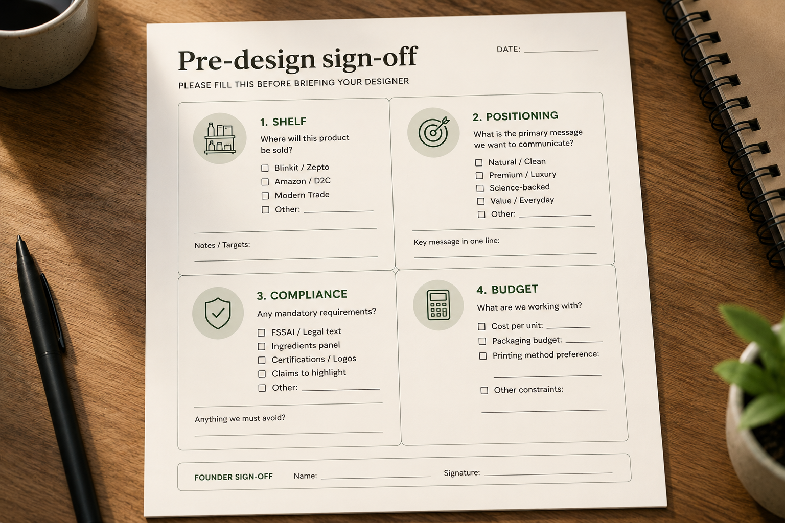
Confirm all four points above in writing before any design work starts. This single document becomes the brief your designer or printer works from, and it prevents the most expensive rework later.
Design Checklist: Structure, Material, and Print
This is where most startup budgets get spent and most startup mistakes get made.
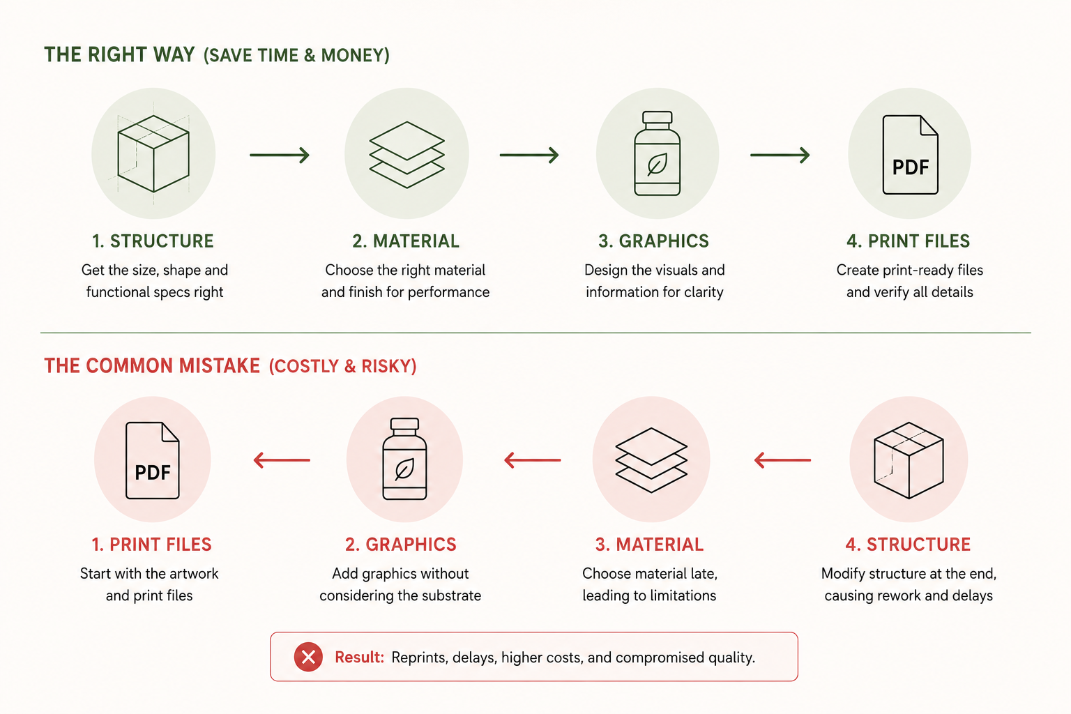
1. Structure before graphics.
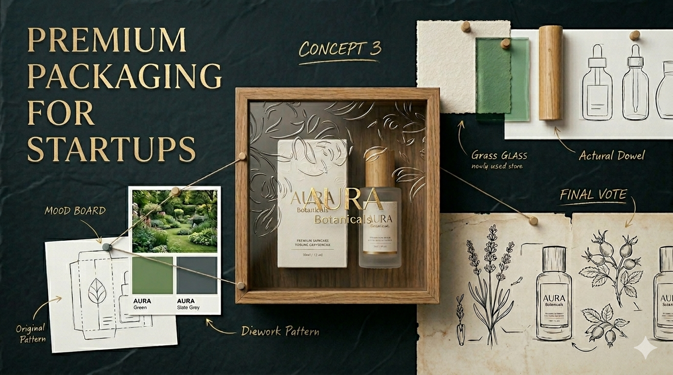
Bottle, pouch, carton, or jar should be chosen based on product fill, fragility, and shipping, not on what looks appealing in a moodboard. Choosing structure after graphics is one of the most common and expensive sequencing mistakes in startup packaging.
Getting structure wrong has direct business consequences:
- Wrong dimensions increase shipping cost per unit, often significantly
- Fragile structures in the wrong courier network produce damage rates that erode margins
- Poorly sized packs create storage inefficiency at the fulfilment level
- Structures that do not stack correctly fail modern trade planogram requirements (a planogram is a retailer's diagram of exactly how products should be arranged on a shelf)
The structure brief comes before the design brief, not alongside it.
2. Material matches the price tier.
A thin, lightweight plastic bottle on a product priced for an upscale tier undercuts its own pricing before the label is even read. The Whole Truth made ingredients the hero of the packaging, reinforcing its core promise of transparency, and that material and typographic decision directly built category trust. Competitors used gloss finishes and hero claims; The Whole Truth used plain type and honest material, which was a positioning decision executed through packaging.
See our guide to best packaging materials for premium brands for a breakdown of what each material choice signals to a buyer.
3. Colour and typography are tested on a phone screen, not just a large monitor. Most D2C discovery happens on a 6-inch thumbnail, which means what works at full resolution may not work where your customer actually first sees it.
See our guides to packaging psychology explained for a deeper breakdown of how these decisions affect purchase behaviour.
4. Print-ready files are confirmed, including dielines, bleed (the extra margin of design that extends past the trim line so no white edge appears after cutting), colour profiles (CMYK or Pantone, never RGB, since RGB is for screens and prints inaccurately), and a physical proof before full production. A file that looks correct on screen and prints incorrectly on the material is a production problem, not a design problem, and it is caught by a physical proof, not a PDF review.
Lock structure first, request a physical proof on the actual substrate before approving any print run, regardless of whether you're packaging a beverage bottle, a snack pouch, or a skincare jar.
Pre-Launch Checklist: Compliance and Production
1. Mandatory label declarations are final, not pending legal review. FSSAI requires net quantity, MRP, batch number, and manufacturing details on every food pack, and missing one declaration does not just create a legal risk. It holds up your product at the warehouse or point of sale, not at the printer, so by the time you discover the problem the inventory is already in transit.
2. A physical sample has shipped and survived transit.
Run 5 to 10 test shipments across different cities and courier partners before committing to full production. Use the same courier network your customer will use, the same box dimensions, and the same insert configuration. If the structure arrives damaged at this stage, it will arrive damaged at scale.
3. Sustainability claims are accurate, not aspirational. "Recyclable" and "biodegradable" mean specific things under Indian plastic waste management rules, and a misleading sustainability claim creates more reputational risk than having no sustainability claim at all. Buyers are increasingly label-literate, and the gap between a claimed and an actual sustainability practice is one the internet will find.
4. Minimum order quantities (MOQs, the smallest batch size a printer or manufacturer will produce) match your cash flow, not your ambition. Many startups over-order packaging at launch and sit on inventory for a product that is still being iterated. Order enough to validate the channel, not enough to fully commit before the product has earned that commitment.
Treat this as a hard gate: do not place the final production order until all four boxes are checked, across food, personal care, or any other category you're launching in.
Packaging Mistakes That Cost Startups Money
The checklist above exists because the same mistakes repeat across almost every startup's first production run. These are not edge cases. They are the default failure pattern for first-time founders working through packaging without a structured process.
Designing before positioning is settled. A pack designed before the brand's positioning is clear will communicate the wrong thing to the wrong buyer. The most common version of this is a founder with an upscale-tier product who lets the designer default to an accessible aesthetic because no one defined the intended tier clearly enough to brief against it.
Skipping the physical proof. Approving packaging from a PDF or a screen mockup is the single fastest way to discover problems after 10,000 units are already printed. Colours shift between digital and physical, finishes change how colours read, and text that was legible at screen resolution becomes illegible on a soft-touch matte label. A physical proof is not optional; it is the only review that matters.
Ignoring quick-commerce thumbnails. Packaging designed for a physical shelf collapses at 80 to 100 pixels. Fine illustration, light-weight typography, and multi-line copy as the dominant front-panel element all fail in a Blinkit or Zepto listing grid. Testing the design at thumbnail scale before production is a 10-minute check that prevents a known conversion problem.
Over-ordering inventory before the product is validated. High MOQs feel like efficiency, but for a product that is still being iterated, they are a cash-flow risk. Order enough to test the channel. Do not order enough to fund a warehouse problem.
Choosing materials purely on cost. The cheapest substrate that holds the product is not always the right substrate. Material choice signals price tier, communicates brand values, and determines how the product physically feels in the customer's hand, so choosing on cost alone often produces a material mismatch that undercuts the price point.
Missing compliance requirements and discovering them at the warehouse. Compliance declarations left to "add later" are the declarations that get missed. Map requirements before the design brief and build them into the layout from the start. Catching a missing FSSAI declaration after print is an expensive problem; catching it before the dieline is finalised is a five-minute fix.
We have broken these down in further detail in our guide to common packaging design mistakes, worth a read before you sign off on your first print order.
Go through this list of six mistakes against your current packaging plan and mark any that already apply, since each one is cheaper to fix now than after print.
Looking Premium on a Startup Budget
You do not need a large print budget to look considered. Restraint communicates an upscale feel more reliably than embellishment: one good typeface, one accent colour, and a structural choice that fits the hand beat four colours and a foil stamp every time.
The mental model that works: premium is communicated through restraint, consistency, and material choice, not decoration. A brand that uses one typeface consistently, one material finish correctly, and one dominant colour confidently will read as more upscale than a brand that uses five design elements and executes each one partially.
If most of your sales will happen on a 6-inch screen rather than a shelf, your priorities shift further. Unboxing moments and product photography matter more than how the pack looks under store lighting, whether you're shipping a coffee subscription box, a skincare set, or a snack hamper.
Our guides on how to create premium packaging for startups to go deeper on both scenarios.
Pick your one typeface, one accent colour, and one material finish before adding anything else to the design, and resist the urge to add a fourth element to compensate for uncertainty about the first three.
When to Bring in a Packaging Design Agency
A founder can run the pre-design checklist internally with the right brief. The stages where most early-stage teams lose weeks to trial and error, or ship a production-ready mistake, are structure selection, material sourcing, print-ready file preparation, compliance verification, and printer coordination. These are not design problems. They are production and compliance problems that look like design problems until the first reorder.
Most founders searching for a packaging company for startups are looking for a partner who understands first-production-run constraints, not enterprise retainers. If that is where you are, look for a studio that has taken packaging from brief to print-ready file for brands at your stage, in your category, and for your primary sales channel, and ask to speak with a founder they have worked with before signing.
Our packaging design services are built specifically for this stage.
If you've completed the pre-design checklist yourself and are stuck on structure, material, or compliance, that is the point to bring in a specialist rather than continuing solo.
Packaging Checklist Summary
Copy this list and use it as a sign-off tool before each production stage.
Strategy
- Positioning defined (upscale or accessible, with specific material and colour implications)
- Primary sales channel selected (quick commerce, modern trade, D2C, or ecommerce)
- Compliance requirements mapped by category
Design
- Structure approved (based on fill, fragility, and shipping, not aesthetics)
- Material selected and matched to price tier
- Typography approved and tested at thumbnail scale
- Colour approved and tested on a phone screen
- Thumbnail tested at 80 to 100 pixels on an actual device
Production
- Print-ready files confirmed (dielines, bleed, CMYK or Pantone colour profiles)
- Physical proof approved on the actual substrate and finish
- Shipping test completed across multiple cities and courier partners
- MOQ validated against current cash flow, not projected demand
If you are building or rebuilding a D2C brand and want packaging that communicates value instantly across shelf, ecommerce, and quick commerce, see our packaging design services and D2C branding work.