.png)





Packaging Psychology Explained: Why Shoppers Decide Before They Read a Word
A shopper picks up a product, or scrolls past it, in under three seconds. Research in consumer behaviour consistently points to this window as the critical decision point: no label has been read, no ingredient list processed, no price consciously registered.
Just a visual and physical impression that the brain has already converted into a judgement: trustworthy or not, premium or cheap, for me or not for me.
That judgement is packaging psychology at work. It is the set of design decisions, mostly invisible to the shopper, that shape how a product is perceived before any conscious reading happens, and in 2026, with quick commerce platforms like Blinkit and Zepto compressing that window even further to a thumbnail-sized first impression, understanding packaging psychology is no longer optional for brands that want to grow.
For Indian D2C (direct-to-consumer, meaning a brand selling straight to shoppers rather than through a separate retailer) brands competing on crowded BigBasket listings, Blinkit thumbnails, and D-Mart shelves, whether in skincare, food, or beverages, packaging psychology is the difference between a product that gets picked up and one that gets scrolled past.
That difference shows directly in trial rate, conversion rate, and revenue.
What Is Packaging Psychology?
Packaging psychology is the study of how design elements on a product, such as colour, shape, material, typography, and information hierarchy, influence a consumer's perception, trust, and purchase decision, often before they consciously process any written information.
It draws on principles from cognitive psychology, visual perception research, and consumer behaviour studies. The foundational idea is straightforward: the brain processes visual information significantly faster than text, and packaging is designed to use that speed advantage in the seconds that matter most for conversion.
For D2C brands, packaging psychology answers one practical question: what does this design make someone feel and assume, instantly, before they think about it? And more importantly, does that assumption lead them to buy?
.png)
The 5 Psychological Principles Behind Effective Packaging
1. Colour Triggers an Emotional Shortcut Before Logic Engages
Colour is processed by the brain faster than shape or text, which is why packaging colour carries so much commercial weight. It is the first signal that registers, and it sets the frame through which every other element on the pack is interpreted.
It is worth noting that colour associations are not universal; they vary by category, cultural context, and buyer demographic. What reads as upscale in one category can read as cold or clinical in another, and the associations below reflect patterns observed across Indian D2C consumer categories specifically.
- White and soft pastels signal purity, safety, and clinical trust, common in active skincare and pharma-adjacent categories
- Black and deep charcoal signal potency, luxury, and confidence, common in premium grooming and high-concentration actives
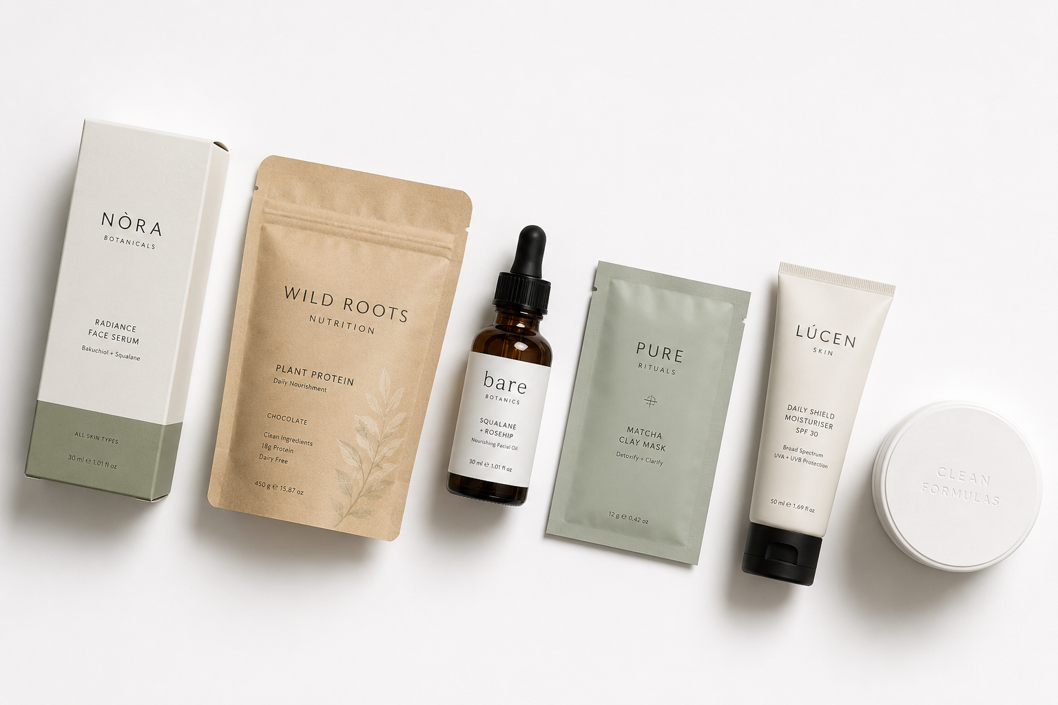
- Green and sage signal natural origin and environmental conscience, common across clean beauty and wellness
- Warm earth tones like terracotta and beige signal heritage and ingredient authenticity, increasingly used by India-rooted food and Ayurvedic brands
Indian brand examples: Minimalist uses stark white and black with no decorative colour at all, and that absence of colour itself becomes a psychological signal that nothing here is hiding behind aesthetics. That restraint is a deliberate psychological choice, not a lack of one.
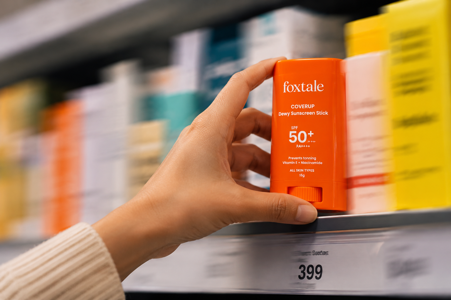
On the opposite end, MCaffeine's neon colour system of yellow, purple, and orange works as a category disruption signal in a skincare aisle dominated by muted tones, the same disruption playing out in its beverage line. Both are deliberate colour psychology decisions, just working in opposite directions.
See our guide to packaging design for D2C brands for a full breakdown of colour strategy by category.
Name the single emotion your packaging colour is meant to trigger in one word, then check that colour against the chart above before your next print run.
2. Shape and Form Suggest Quality Before the Material Is Touched
The human brain associates certain physical shapes and weights with quality tiers, an effect that researchers in consumer psychology have documented across multiple product categories. This happens independently of what is actually inside the packaging.
- Rounded, soft forms tend to read as gentle, approachable, and often feminine
- Sharp, angular forms tend to read as clinical, modern, and precision-engineered
- Heavier glass and metal closures read as premium, regardless of the liquid inside
- Thin, lightweight plastic reads as disposable and low-cost, even when the formulation is excellent
Studies on perceived value and package weight have found that consumers consistently rate the same product as higher quality and worth more when it is presented in heavier, more substantial packaging, a finding that has direct implications for price point defensibility.
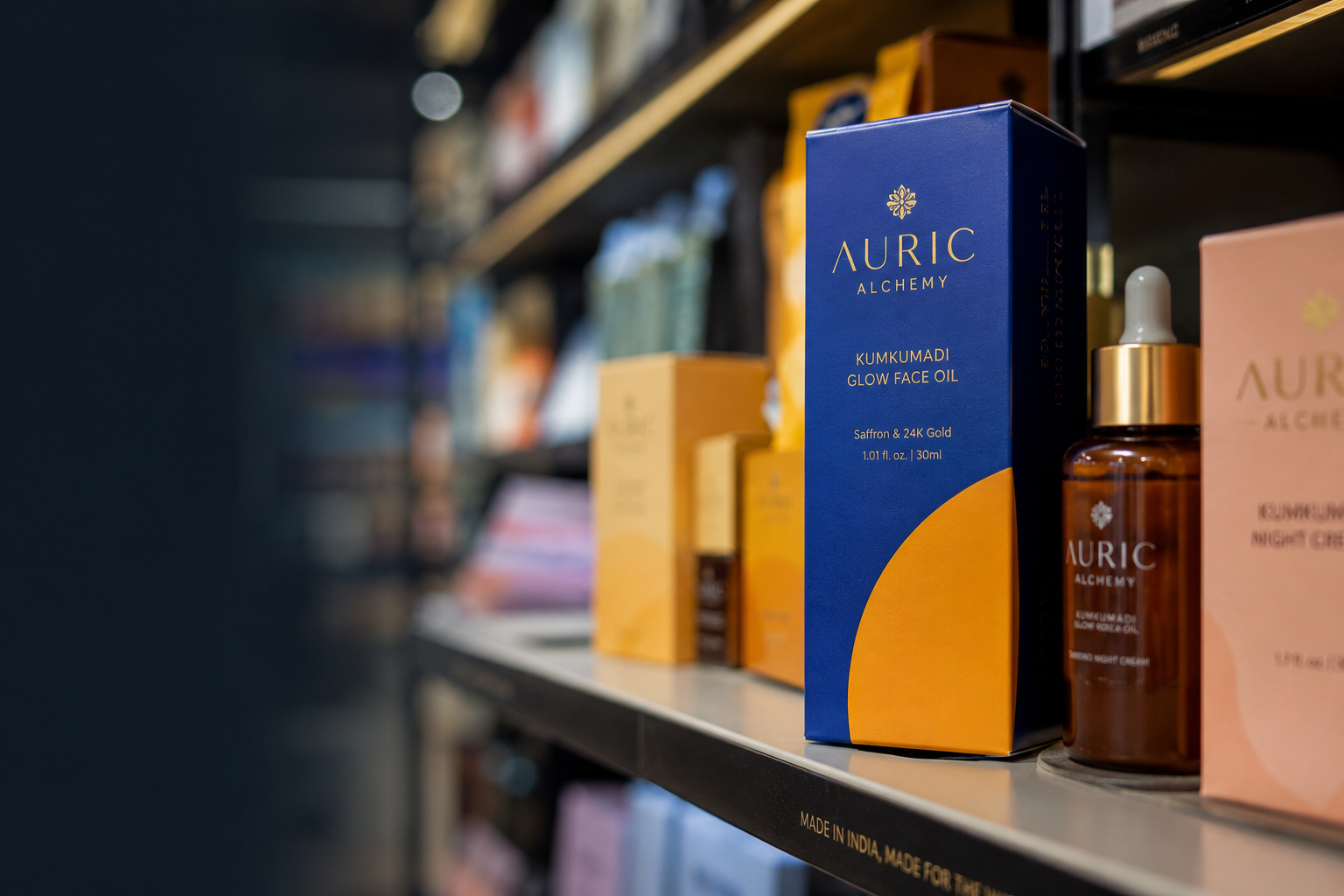
Example across categories: A serum positioned at an upscale price tier but packaged in a flimsy plastic bottle will typically underperform the same product in weighted glass with a metal dropper, not because the contents differ, but because the hand registers weight as value before the brain reasons about price.
The same principle applies in food: a ghee brand in a heavy glass jar with a metal lid commands more perceived value than the identical product in a standard plastic tub, even at the same price point, and the principle holds again for a coffee brand using a weighted tin versus a thin foil pouch.
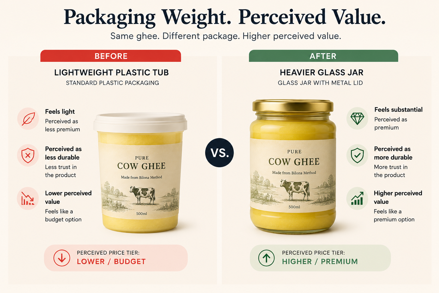
Pick up your current packaging and ask honestly whether its weight matches the price tier you're charging, then compare it against one heavier and one lighter competitor on the same shelf.
3. Visual Hierarchy Tells the Brain What to Trust First
When a shopper's eye lands on packaging, it does not read everything equally. It follows a hierarchy, usually the largest, highest-contrast element first, then moving down in order of visual weight, and packaging psychology uses this pattern deliberately.
- The single most important claim is placed in the largest type, highest-contrast position
- Supporting information (ingredients, certifications, usage) is placed in a secondary, smaller tier
- Regulatory and compliance text (FSSAI declarations, the food safety label requirements set by India's Food Safety and Standards Authority, net weight, batch code) is placed last in the visual order, even though it is legally mandatory
Indian brand example: The Whole Truth places the ingredient list, in full and in plain English, as the dominant visual element on its packaging. There is no slogan competing for attention, no lifestyle imagery pulling the eye elsewhere, and the hierarchy itself communicates that the brand has nothing to hide before a single word is read.
How to audit your own packaging hierarchy: Print your pack at full size and hold it at arm's length. Whatever your eye goes to first is what your hierarchy is communicating, and if it is not your primary benefit claim or brand name, the hierarchy is working against you.
Then resize it to 100x100 pixels, your Blinkit and Amazon thumbnail size: if the first element that registers is not your brand colour or a recognisable visual anchor, your hierarchy is losing sales in quick commerce regardless of how well it reads at shelf.
See our guide to FMCG branding to understand how hierarchy decisions differ across retail channels.
Run the arm's-length test and the 100-pixel test on your own pack today and write down what your eye actually lands on first in each.
4. Familiarity Reduces Perceived Risk, Novelty Increases Attention
This is the central tension in packaging psychology. Shoppers trust what looks familiar to the category, because familiarity reduces the perceived risk of an untested purchase, but shoppers also need something distinctive enough to notice in a crowded shelf or listing grid.
The brands that resolve this tension most effectively follow a consistent pattern.
The Familiarity-Novelty Framework:
- Familiar in structure: bottle shape, label position, claim placement, and information order all match category conventions closely enough that the brain registers this as belonging in the category
- Distinctive in one dominant element: usually colour, a single graphic motif, or an unusual typographic choice that no competitor owns in that category
This framework matters because departing from category convention on multiple elements simultaneously increases perceived risk. Shoppers are more likely to try something that looks almost familiar but slightly unexpected than something that looks completely foreign to the category.
Indian brand examples: MCaffeine keeps standard category bottle and tube shapes that a skincare or grooming shopper instantly recognises, but uses neon colour blocking that no competitor owns, so the familiarity earns trust while the neon earns the click.
Slurrp Farm, a children's food brand, follows the same principle: familiar pouch and box formats that parents recognise from the category, paired with a distinctive illustration world no competing brand uses.
.png)
Identify the one element you want to own as distinctive, then audit every other element of your pack to confirm it still matches category convention closely enough to feel familiar.
5. Material and Finish Signal Price Before the Price Tag Is Read
Touch is processed almost as quickly as sight, which is why material finish has an outsized effect on perceived value, even in ecommerce contexts where the finish is only seen, not touched.
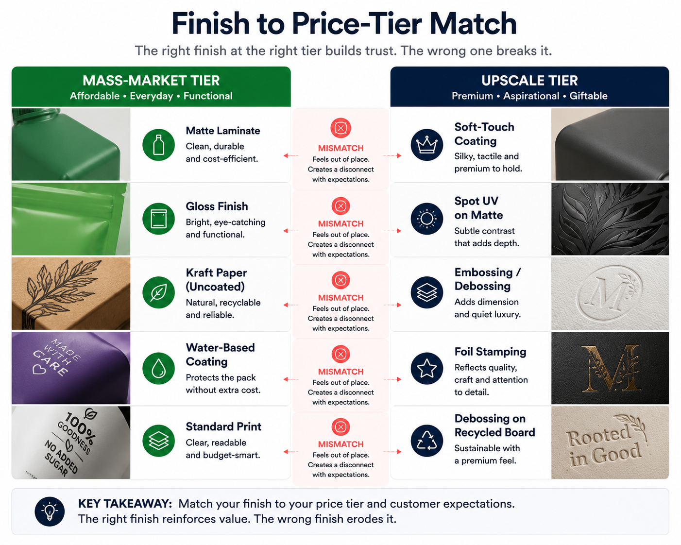
- Soft-touch matte lamination reads as more premium than gloss, even on identical paper stock
- Embossing and debossing (raised or pressed-in detail) signal craftsmanship and intentional design investment
- Spot UV on a matte base (a glossy varnish applied over selected areas of a matte surface) creates a tactile and visual contrast that the brain associates with quality
- Thin, flexible plastic and standard gloss lamination read as mass-market, regardless of the formulation's actual price point
Industry-wide feedback from Indian modern trade retail buyers consistently flags material finish as a factor in whether a new D2C brand earns shelf space next to established players, meaning the packaging material is part of the commercial evaluation, not just the aesthetic one.
Cost implications and when premium finishes matter: Soft-touch lamination and spot UV both add a modest per-unit cost at standard D2C run sizes. For brands priced at an upscale tier, that cost is commercially recoverable because the finish directly supports price point perception and reduces buyer hesitation.
For brands priced at a mass-market tier, the same finishes may create a category mismatch, since the pack looks more expensive than the buyer expected, and that gap creates friction rather than confidence. The finish decision should always be evaluated against the price tier, not just the brand aspiration, whether the product is a serum, a snack, or a specialty coffee blend.
See our guide to packaging redesign to understand how material and finish upgrades fit into a brand repositioning.
Match your shortlisted finish against your actual price tier using the chart above before committing to a print spec.
Why This Matters More for Indian D2C Brands in 2026
Most foundational psychology research on packaging was built around one context: a shopper standing in front of a shelf. That context still exists, but Indian D2C brands in 2026 now have to win the same psychological battle across at least three different contexts simultaneously, each with its own constraints, its own signal hierarchy, and its own failure modes.
The channel landscape has shifted significantly:
Quick commerce has grown faster than almost any other retail format in India. Blinkit crossed 1 billion orders annually ahead of schedule, Zepto expanded from a handful of cities to over 25 in under two years, and Swiggy Instamart is now a primary grocery channel for urban households in the top 10 metros.
A significant portion of trial purchases for Indian D2C brands, particularly in wellness, personal care, and clean food, now happen through quick commerce first, not through modern trade or branded websites.
This matters for packaging psychology because quick commerce is a thumbnail-first shopping environment. The product appears as an 80 to 100 pixel image in a scrolling grid, and the buyer is making a decision in under two seconds, often on a phone, often while doing something else.
The psychological signals that work at shelf, such as weight, texture, embossing, and the satisfying click of a premium closure, are completely invisible, since only colour and a basic silhouette survive at that scale.
At the same time, category saturation has increased across every major Indian D2C segment. Skincare has gone from a handful of D2C entrants to hundreds, and supplements, clean food, and personal care have followed the same trajectory.
The psychological differentiation work that packaging needs to do is harder now than it was five years ago, because the shelf, physical and digital, is more crowded.
What this means in practice:
- A packaging design that works psychologically at shelf scale can fail completely at quick-commerce thumbnail scale
- Designing for the richest sensory context, the physical shelf, and ignoring the most constrained one, the 80-pixel thumbnail, is one of the most common and expensive packaging mistakes in Indian D2C today
- Packaging psychology in 2026 means designing for the weakest signal context first, the thumbnail, and then confirming the richer signals work at shelf
Check your own packaging against all three rows of the table above before assuming a design that works at shelf will also work in a quick-commerce grid.
Common Packaging Psychology Mistakes Indian D2C Brands Make
Most packaging psychology failures are not random. They follow predictable patterns that show up consistently across Indian D2C categories.
1. Premium pricing with budget-looking packaging. A product priced at an upscale tier but packaged in thin plastic with standard gloss lamination creates an instant psychological mismatch. The price says premium and the pack says mass-market, so the shopper resolves that contradiction by either not buying or feeling overcharged when they do. The packaging finish must match the price tier before the price is even read.
2. Too many claims competing for attention. When five benefit claims are given equal visual weight on the front panel, the hierarchy tells the buyer nothing is important. Psychologically, a pack with too many competing claims reads as either confused or desperate, neither of which builds trust, and one primary claim, dominant and clear, consistently outperforms a crowded front panel.
3. Designing for shelf and ignoring ecommerce. Packaging designed to shine at full size under retail lighting often collapses at thumbnail scale. Fine illustration detail, multi-line copy as the primary visual, and low-contrast colour combinations can work beautifully in a physical store but lose their psychological impact entirely in a 100-pixel listing image.
4. Accidental hierarchy. When visual hierarchy is not deliberately designed, the eye defaults to whatever is largest or highest-contrast, which is often the logo, a certification badge, or a regulatory declaration. An accidental hierarchy that leads with the FSSAI number and buries the primary benefit claim is not a neutral mistake; it is actively losing sales at the moment of purchase consideration.
5. Colours that contradict category expectations without earning the departure. Departing from category colour conventions can work, but only when the brand has enough other familiar signals to earn that departure. A wellness brand in neon orange with no other category-familiar cues creates confusion rather than differentiation, since the colour psychology has to be earned by the surrounding context, not imposed on it for its own sake.
See our guide to brand positioning to understand how packaging psychology fits into broader brand strategy.
Go through the five-point list above against your own current packaging and flag anything you recognise before your next production run.
The 4-Second Packaging Test: A Framework for Founders
Before finalising any packaging design, run it through this framework. Each question reflects a psychological checkpoint that the shopper's brain processes, whether or not they are aware of it.
Question 1: What is it? In the first second, does the pack communicate what category this product belongs to? If a shopper cannot place it in a category immediately, the brain registers it as unfamiliar, and unfamiliar products carry higher perceived risk, which reduces trial rate.
Question 2: Who is it for? In the second second, does the design signal that this product is for the shopper looking at it? This is communicated through colour associations, visual language, price-tier signals, and the implied lifestyle the packaging suggests, and a mismatch here, such as a clinical pack targeting a wellness-seeking buyer, loses the sale before a claim is read.
Question 3: Why is it different? In the third second, is there one element that makes this pack distinct from the five competitors around it? Not different in every dimension, just one owned, distinctive element that gives the buyer a reason to pause rather than move on.
Question 4: Does it feel worth the price? In the fourth second, do the material, finish, weight, and visual quality signal that the product inside is worth what it costs? If any of the physical signals contradict the price tier, the psychological response is either scepticism or a sense of overpricing.
If the packaging fails any one of these four checkpoints, conversion suffers at the shelf, in the ecommerce listing, and in the quick-commerce thumbnail, so run this test before, not after, the print file is finalised.
How to Apply Packaging Psychology to Your Brand
Before your next packaging brief, run these five checks.
1. What single emotion should the colour trigger in under one second? If you cannot answer this in one word, the colour choice needs more clarity. "Confident" is an emotion; "premium" is not. Define the emotion, then verify the colour earns it in your specific category context.
2. Does the shape and weight match the price tier you are claiming? A premium price with a lightweight, flimsy form creates a psychological mismatch that erodes trust at the point of physical contact. Hold a prototype, and if the form does not feel like the price, the form needs to change before the label does.
3. What does the eye see first, second, and third? If the answer is not deliberately designed, the hierarchy is accidental, and accidental hierarchies usually highlight the wrong thing. Map the visual order intentionally before the design is finalised.
4. Does the design still work with touch and full-size viewing removed? Test it as a thumbnail at 100 pixels. If the psychological signal disappears at that size, it will lose sales in quick commerce regardless of how well it performs at shelf, and this is a commercial requirement, not a nice-to-have, for any brand selling on Blinkit, Zepto, Amazon, or BigBasket.
5. Would this still stand out next to five competitors? Do not test your packaging in isolation. Screenshot five competitor products in your category from Amazon or Nykaa and place your design in the same grid: if it disappears into the category noise, the differentiation is not working, regardless of how strong it looks on its own.
Run all five checks against your current or proposed packaging before the next design brief goes out, and treat any unanswered check as unfinished work.
Most D2C Packaging Loses Customers Before They Ever Read the Label
The psychological signals that drive trial decisions, such as colour, shape, finish, and hierarchy, are set before a single word is read. Getting those signals right is not a design question; it is a conversion question, whether you sell skincare, snacks, or specialty beverages.
If you are building or rebuilding a D2C brand and want packaging that communicates value instantly across shelf, ecommerce, and quick commerce, see our packaging design services and D2C branding work.