.png)





Branding Strategies for Indian Startups: What Actually Works in D2C
Many Indian D2C (direct-to-consumer) founders launch with a product they believe in, only to find that shoppers don't pick it up, retailers don't take it seriously, and paid ads burn money without converting. The product hasn't changed. The brand is doing the damage.
Poor branding affects sales before a single rupee of advertising is spent. It erodes trust at the shelf, inflates customer acquisition costs, and makes it harder to get stocked by modern trade retailers, whether the product is a skincare serum, a snack bar, or a bottle of cold brew concentrate.
A branding strategy for an Indian startup is the deliberate set of decisions that determine how your brand looks, sounds, and behaves across every customer touchpoint, from packaging to product page to a retail buyer pitch. It is not a logo exercise, it is the commercial infrastructure that makes people choose you over a competitor with an equivalent product.
India's D2C market is projected to cross $100 billion by 2027 (Redseer Strategy Consultants). In that environment, the brands that grow are not necessarily the ones with the best products, they are the ones that communicate value fastest, build recall across channels, and look credible enough for shoppers to take the first risk. This guide covers what branding strategies actually deliver those outcomes for Indian startups.
What Most Indian Startups Get Wrong About Branding
Most founders treat branding as an aesthetic task. They commission a logo, pick a colour palette, and call it done, and the result is a brand that looks fine in isolation and falls apart the moment it sits next to six competitors on a BigBasket shelf.
The gap is between visual branding and a brand system. A logo is a mark, while a brand system is the full set of visual and verbal rules that make your brand recognisable and consistent at every touchpoint: packaging, website, Instagram, retailer pitch deck, product inserts, and WhatsApp catalogues.
Brands that grow fast in Indian D2C have systems, not just assets.
See our blog on the difference between branding and packaging to understand why a logo alone is not a brand system.
6 Branding Strategies That Work for Indian D2C Startups
Strategy #0: Own a Clear Position Before You Build an Identity
Positioning comes before the logo, the colours, the packaging, and the guidelines. Without a clear position, every design decision is guesswork.
Positioning answers four questions: who is this brand for, why is it different from everything else in the category, why should customers care, and why now?
Juicy Chemistry built its identity around certified organic formulations at a time when "natural" had become a vague claim. Their positioning, genuinely traceable ingredients for buyers who had stopped trusting labels, came first, and the brand system followed.
A brand with no clear position produces design that looks like everything else in the category, because there is no brief for the designer to be distinct against.
Try this: Complete this sentence: "We exist for [specific buyer] who wants [specific outcome] and can't get it from [specific alternative]." If that sentence takes more than one round of revision, the positioning isn't ready yet.
See our guide to brand identity vs branding vs brand strategy for how positioning fits before any visual work begins.
.png)
Strategy #1: Build a Visual Identity System, Not Just a Logo
Your logo is the centrepiece of your brand, not the whole building. A functional visual identity system includes primary and secondary logo versions (horizontal, stacked, icon-only), a defined colour palette with exact hex codes (the six-character codes used to specify exact colours on screens) and print-equivalent values, two typefaces maximum, one for headlines and one for body and functional copy, a graphic device or illustration system that works across products and formats, and clear rules for how all of the above combine across packaging, digital, and print.
Without a system, every new asset your team produces requires a creative director to supervise it. With a system, your in-house team, your printer, your influencer partners, and your ad agency can all produce on-brand work independently.
MCaffeine is the clearest Indian D2C example of this done right, in the personal care category. Their visual identity, high-contrast neon, a bold single-ingredient hero, consistent type hierarchy, is so consistent that every product in their range reads as instantly theirs. A competitor launching a new variant creates confusion, MCaffeine launching a new variant creates recognition, and the difference is a system, not a logo.
Try this: Hand your current logo file and colour codes to a designer who has never seen your brand and ask them to design a product variant pack. If the result doesn't look obviously related to your existing range, you have a logo, not a system.
See our guide to logo design for D2C brands for what a functional logo suite needs beyond the primary mark.
Strategy #2: Own a Colour Before You Own a Category
Colour is the fastest-processing visual signal a shopper has. Before they read your brand name, before they register your claim, they process your colour block.
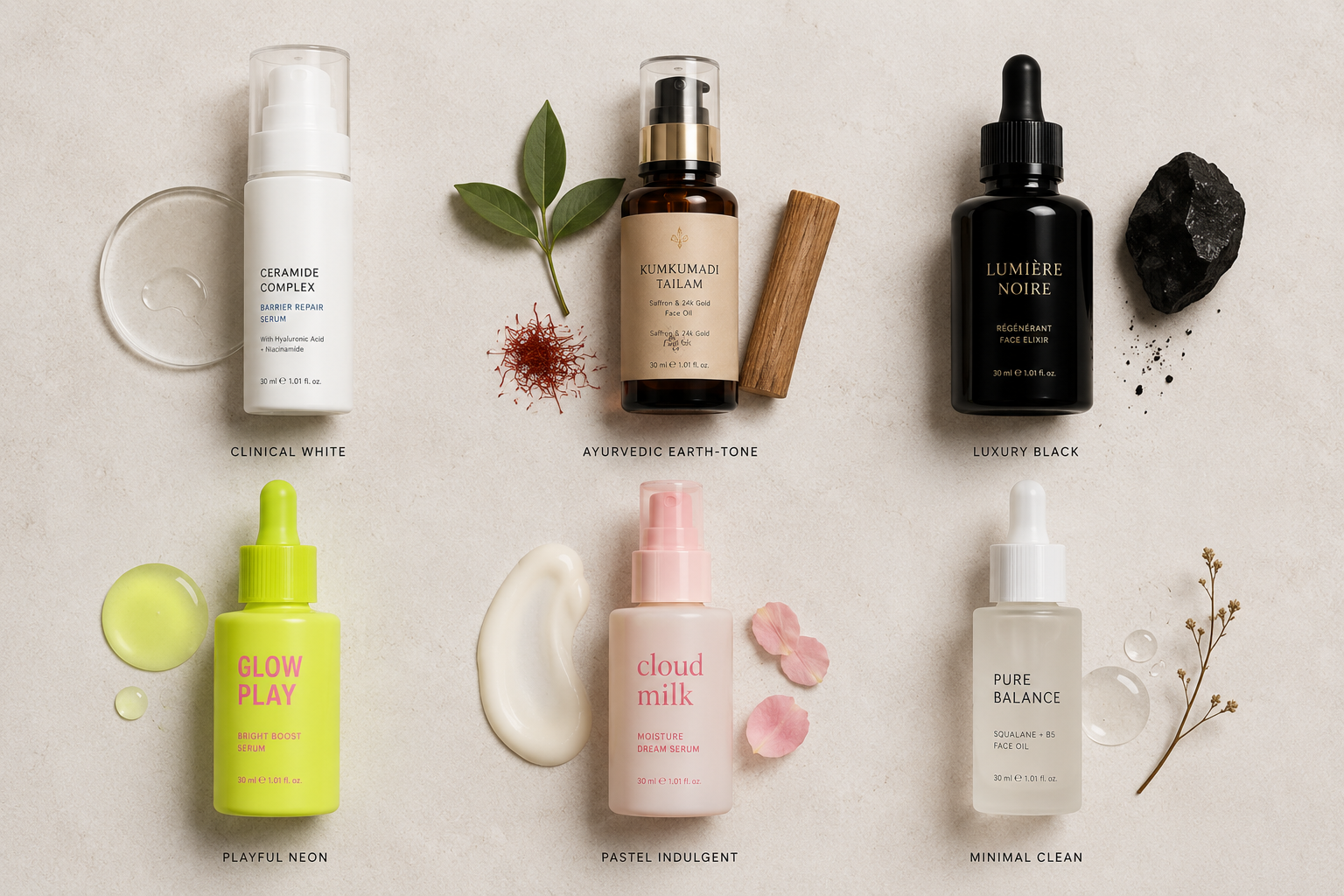
Most Indian startups default to green (natural, organic), white (clean, clinical), or black (premium). These choices are understandable but not differentiating, and when five brands in the same category use the same colour logic, none of them win on shelf.
The strategic move is to identify a colour that is meaningfully underused in your specific category and claim it with consistency. Every piece of packaging, every digital asset, and every campaign visual should reinforce the association until the colour and the brand become linked in the shopper's memory.
But colour alone doesn't create brand recognition, it only works when paired with consistent positioning and consistent execution. Minimalist built clear shelf presence on a clinical grey-white system at a time when Indian skincare was full of soft pastels and natural greens, and their colour choice was a direct signal: this is science, not beauty. The colour worked because the positioning was sharp, and one without the other produces a brand that looks different but means nothing.
Try this: List the dominant colour of your five closest competitors. If three or more share the same colour family, that's the space to move away from, provided it still fits your positioning.
See our blog on how visual identity affects conversions to see how colour strategy drives shelf pick-up and click-through rates.
.png)
Strategy #3: Build a Brand System That Works Across Every Channel
Indian D2C founders in 2026 must design packaging and brand assets that work across multiple distinct contexts, not just one. The channels that matter: retail shelf (high contrast, legible from 3 metres, brand name dominant, primary claim visible in three seconds), ecommerce listing thumbnail (the small preview image shown in listings, with brand name legible at 150 pixels wide and no detail that disappears below 200 pixels), social and digital (high-resolution for Instagram feed, clear in Reels format, brand mark identifiable at story format), marketplace ads (brand colour and name immediately clear even in a cropped or banner format), WhatsApp commerce (product image readable at small sizes in a catalogue card), and influencer and UGC (user-generated content, meaning photos or videos customers create themselves) content, where the brand must be identifiable even when the creator hasn't followed brand guidelines precisely.
Designing for one context and assuming it transfers to the others is the most common reason strong-looking brands underperform on Blinkit, Zepto, or Amazon India. If the brand disappears the moment someone else holds the product, the identity is too fragile.
Try this: Screenshot your product category on a quick-commerce app and resize your artwork to 150 pixels wide. If the brand name and colour block are clear and distinct from the competitors around it, the design works, and if not, fix the hierarchy before going to production.
See our guide to brand consistency across D2C and offline retail for the full framework on holding one system together across channels.
Strategy #4: Use Brand Narrative as a Positioning Tool, Not a PR Exercise
There is an important difference between storytelling and brand narrative. Storytelling is how you communicate, narrative is what you fundamentally believe, and narrative drives positioning while storytelling is how you express it.
A brand narrative is not your founding story. It is the specific belief your brand exists to act on, and it must be commercially meaningful, not just emotionally warm.
The Whole Truth, in the packaged food category, built a category-leading narrative around radical transparency. Every packaging decision, every copy choice, and every campaign follows from the belief that consumers deserve to know exactly what is in their food, with no marketing language in the way, and shoppers can verify it at shelf while retailers can pitch it to buyers.
Sleepy Owl, in the coffee category, built their narrative around the belief that good coffee shouldn't require effort or equipment. Every product format, every piece of packaging, and every communication follows from that position, because the narrative isn't decoration, it is the brief.
A narrative that could apply to any brand in the category, "we believe in natural, sustainable, good-for-you products," is not a positioning tool. It is category noise.
Try this: Complete this sentence: "We exist because [specific belief], and our product proves it by [specific, observable thing our brand does]."
See our guide to storytelling through packaging design for how narrative and packaging work together at shelf.
Strategy #5: Build Brand Guidelines That Your Team Can Actually Use
Brand guidelines are the operating manual for your identity. Most Indian startups either skip them entirely or commission a lengthy design file that no one opens after the handoff meeting.
Here is what happens without functional guidelines: packaging printed by one vendor looks different from packaging printed by another, your Instagram feed has three different visual styles across six months, and an agency you briefed for a campaign comes back with something that looks like a competitor's brand. Every one of these mistakes costs time, money, and brand consistency.
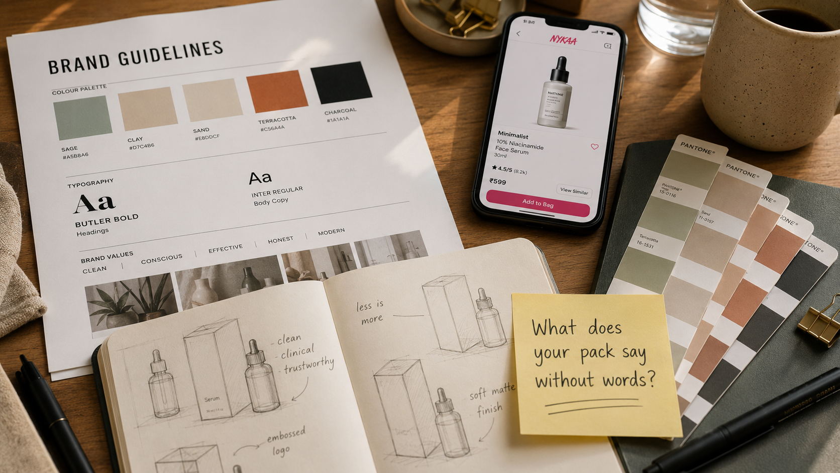
Functional brand guidelines for a D2C startup need four things: logo usage rules (clear and prohibited applications, minimum sizes, clear space around the logo), colour specifications (hex, RGB, CMYK, meaning the four-colour ink system used in most commercial printing, and Pantone, a standardised colour-matching system used in printing, references for every colour in the palette), typography guidance (which font for which context, size hierarchy, line spacing), and application examples (how the brand looks on packaging, on Instagram, on a product listing, on a WhatsApp business profile).
Try this: Hand your brand guidelines to someone outside your team with no extra explanation and ask them to lay out a simple Instagram post. If what comes back looks off-brand, the guidelines are missing something.
Strategy #6: Consistency Beats Creativity
Great brands repeat themselves. Weak brands constantly reinvent themselves.
Recognition is not built by being interesting every week, it is built by showing up the same way, in every format, across every channel, until the association is automatic. A shopper who has seen your brand three times should recognise it on the fourth without reading the name.
Minimalist has not significantly changed their visual system since launch: the clinical white, the ingredient-first hierarchy, the restrained typography are the same across their entire product range and across every channel. What looks like minimalism is actually discipline, and The Whole Truth does the same with their no-bullshit copy tone. Blue Tokai (coffee) and Cosmix (supplements) are both good examples of brands that have maintained visual consistency and built genuine recall without constant redesigns.
Brands that redesign their packaging every 18 months because they are bored of the look are not refreshing their brand, they are resetting the recognition they worked to build.
Try this: Before changing anything about your visual identity, ask whether this is a commercial problem or a boredom problem. If shoppers still recognise the brand and the product is still selling, consistency is the strategy.
See our blog on how branding improves customer retention to understand why consistency compounds long-term value far more than creative reinvention.
.png)
Strategy #7: Time Your Brand Investment to Your Commercial Milestones
Brand investment at the wrong stage wastes money. At the right stage, it compounds every other investment you make.
Invest in a full brand identity system when you are entering retail for the first time, since retail buyers make stocking decisions based heavily on how professional the brand looks, or when you have raised a round and are scaling from one product to a range, since brand inconsistency across products weakens shelf presence. It is also worth investing when your existing brand was built on a bare-bones freelancer budget and it shows, or when customer trust has become the bottleneck: high traffic but low conversion, strong product but weak sales, or retail buyers who aren't taking the brand seriously despite a good product, are all brand signals, not product signals.
Do not invest in a full rebrand when you haven't found product-market fit yet, when you have no distribution strategy (branding cannot fix a channel problem), or when you are doing it because you are bored of the logo, since boredom is not a commercial signal.
See our guide to startup branding cost in India to understand how to time and scope a brand investment against your actual budget.

What Indian D2C Branding Agencies Get Wrong (And How to Spot It)
Not every branding agency produces commercially functional work. The ones that don't fall into predictable patterns.
Portfolio-first thinking: The work looks great in a case study and doesn't transfer to a retail shelf or a 150-pixel quick-commerce thumbnail. Ask to see how their work performed commercially, not just how it looked at presentation.
Strategy without execution: Some studios deliver brand strategy documents but cannot produce a print-ready packaging file. Confirm what the full deliverable set actually includes before signing.
No D2C category experience: A studio that builds brands for hospitality or luxury real estate does not automatically understand FSSAI (Food Safety and Standards Authority of India) compliance, quick-commerce thumbnail design, or how to scale a visual system across multiple products. Category experience matters.
One size fits all: A branding process that looks identical for a skincare brand, a snack brand, and a supplement brand is a templated process, not a strategic one. Ask how the studio has handled different categories differently.
If you want a brand identity built specifically for Indian D2C brands, from visual system to retail-ready execution, that is what Jellypop is built to deliver.
See our blog on how to choose a branding agency to know exactly what to ask before signing with any studio.
The Branding Checklist for Indian D2C Startups
Before you brief a branding agency or begin a rebrand, confirm:
- Clear brand narrative (one sentence: what you exist to act on)
- Target customer defined with specificity (not "health-conscious millennials," that describes every D2C brand)
- Competitor visual review complete (3 direct + 3 reference brands)
- Distribution channels mapped (D2C only, or retail entry planned)
- Budget confirmed including design fees plus print and production costs
- Timeline tied to a commercial milestone (retail pitch, launch, funding round)
- Brand guidelines deliverable confirmed with the agency upfront
See our guide to branding mistakes D2C startups make to avoid the most common ones before you brief an agency.